FESTIVAL
En France, la prévention santé reste inégalitaire et peu visible. Ce projet de groupe visait à repenser son approche à travers un festival inclusif, accessible et engageant.
Dans le cadre d’un workshop, nous avons imaginé ce festival en réfléchissant à sa direction artistique, sa programmation, les activités proposées, les thématiques de prévention mises en avant, ainsi qu’à leur adaptation selon les différentes tranches d’âge.
In France, health prevention remains unequal and lacks visibility. This group project aimed to rethink the approach through a festival that is inclusive, accessible, and engaging.
As part of a workshop, we designed this festival by developing its art direction, programming, proposed activities, key health topics, and how to adapt them to different age groups.
DATE
2025
CLIENT
Projet d’école
LOGICIELS
Illustrator | Photoshop | Indesign | Blender
Présentation
Identité visuelle
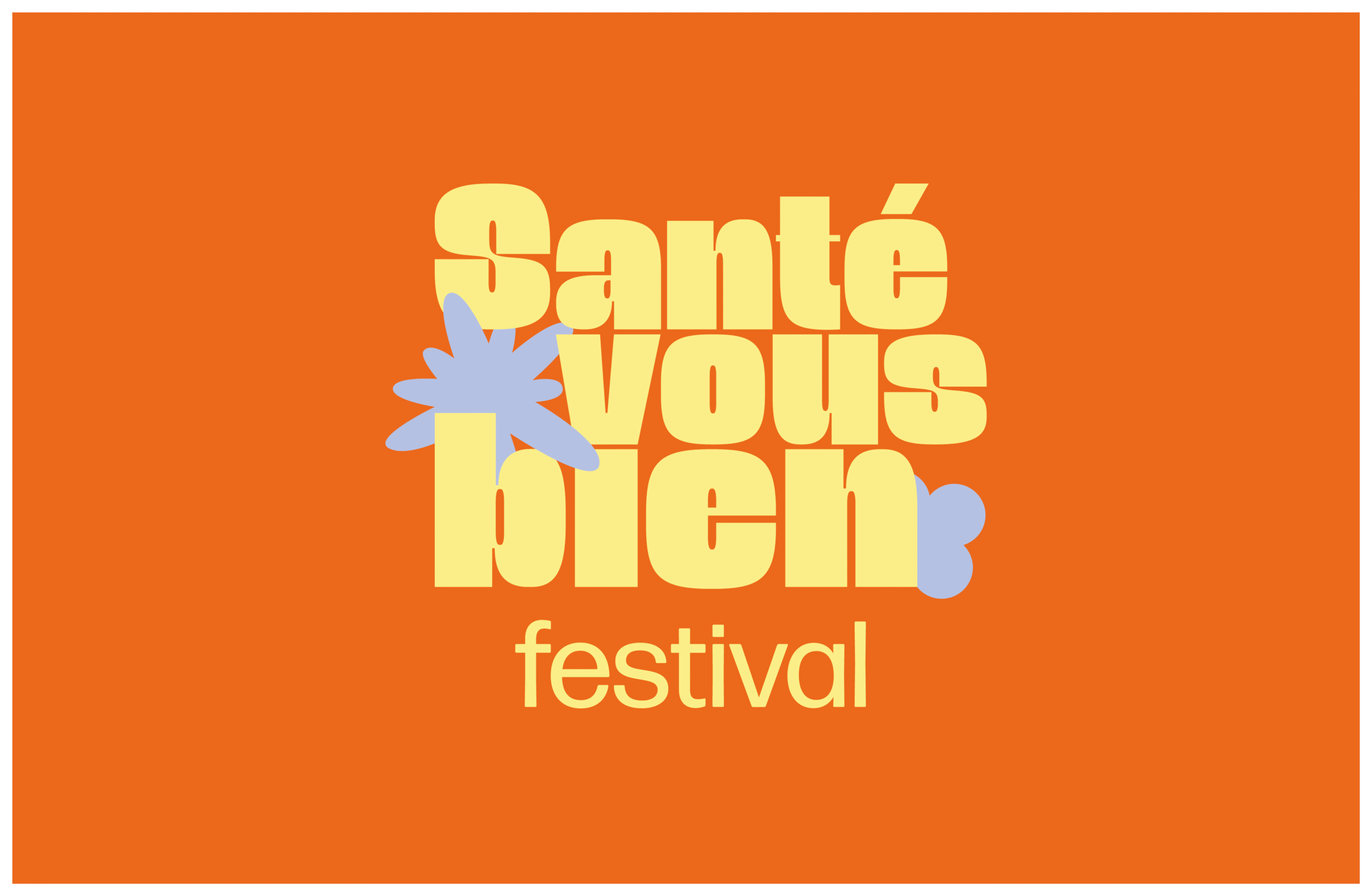
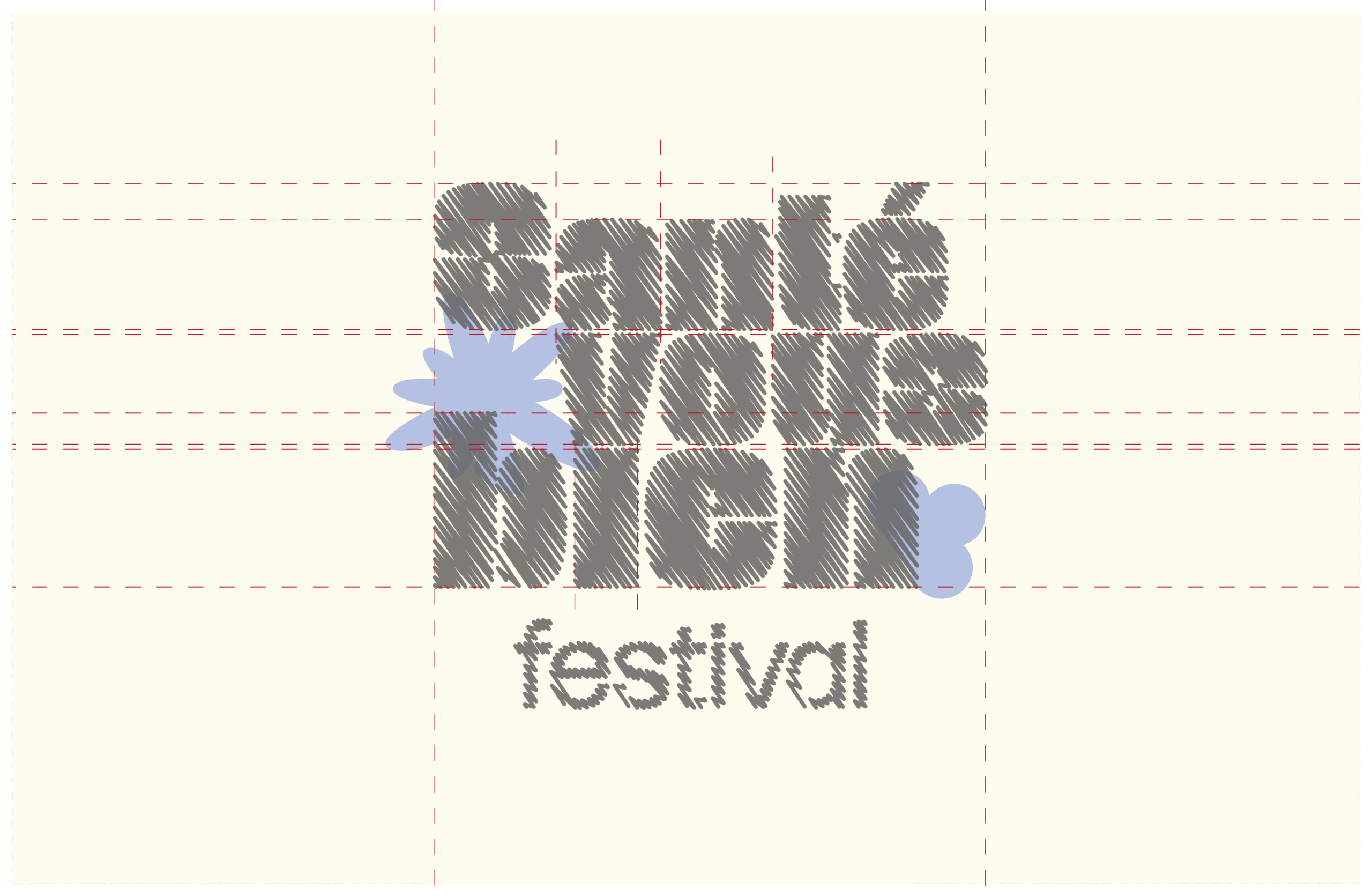
Participation et réflexion autour de la création de l’identité visuelle du festival “Santé-vous bien”.
Nous avons imaginé ensemble le nom du festival : un jeu de mots simple et bienveillant, inspiré des expressions « portez-vous bien » ou « vous sentez-vous bien ? ». Une invitation à prendre soin de soi, à s’informer et à agir dans un esprit positif, accessible et mémorable.
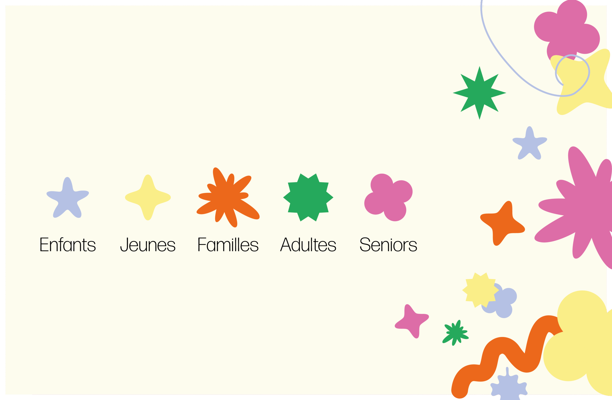
Pour toucher un public large, nous avons défini cinq cibles : enfants, jeunes, adultes, seniors et familles — chacun avec sa propre couleur, son ton et son parcours.
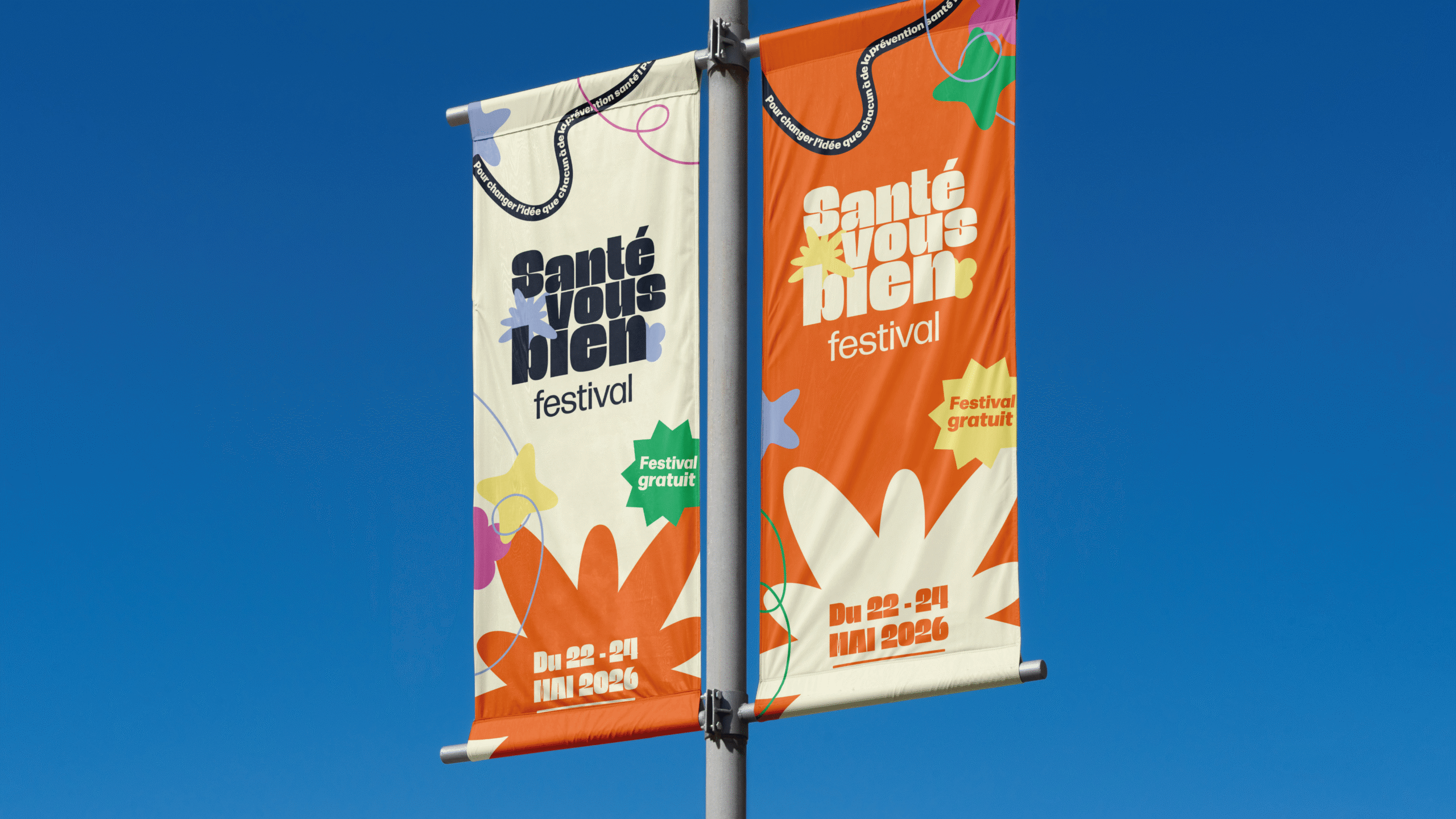
L’univers graphique que nous avons conçu repose sur des formes abstraites, simples et colorées, pensées pour être universelles, lisibles et inclusives. Elles offrent de nombreuses possibilités de déclinaison, tout en restant cohérentes et engageantes.
Participating in and thinking about the creation of the visual identity for the ‘Santé-vous bien’ festival.
Together, we came up with the name of the festival: a simple, benevolent play on words, inspired by the expressions ‘portez-vous bien’ or ‘vous sentez-vous bien’. It’s an invitation to take care of ourselves, get informed and take action in a positive, accessible and memorable way.
To reach a wide audience, we defined five target groups: children, young people, adults, seniors and families – each with their own colour, tone and background.
The graphic universe we have designed is based on abstract, simple and colourful shapes, designed to be universal, legible and inclusive. They offer a wide range of possible variations, while remaining coherent and engaging.
Présentation
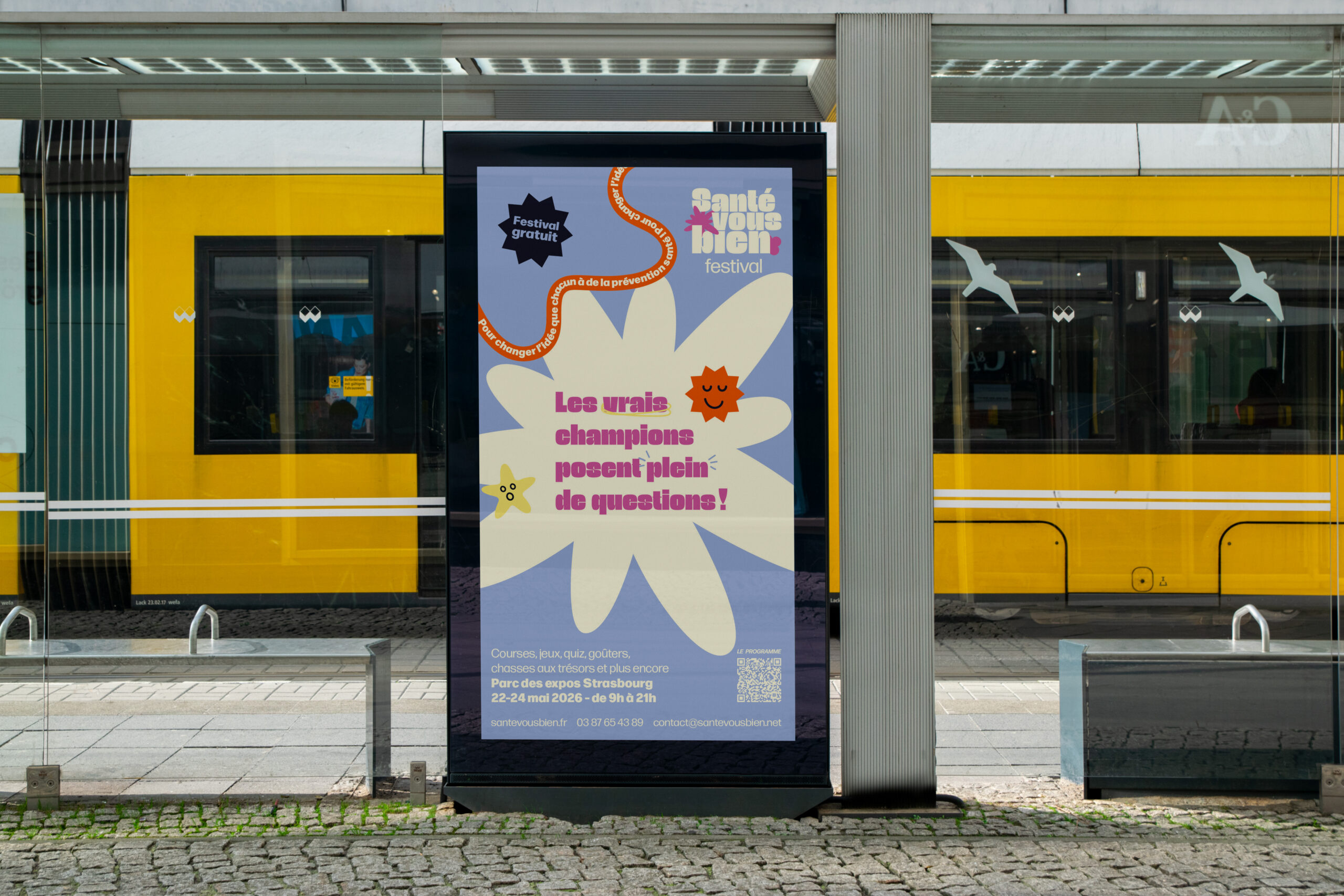
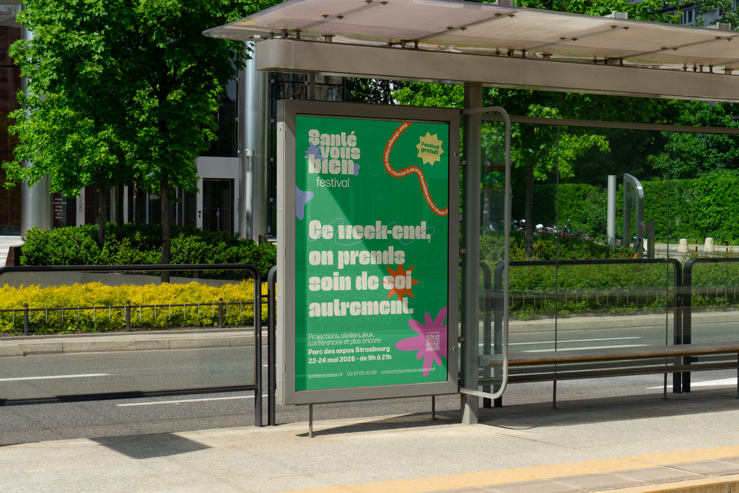
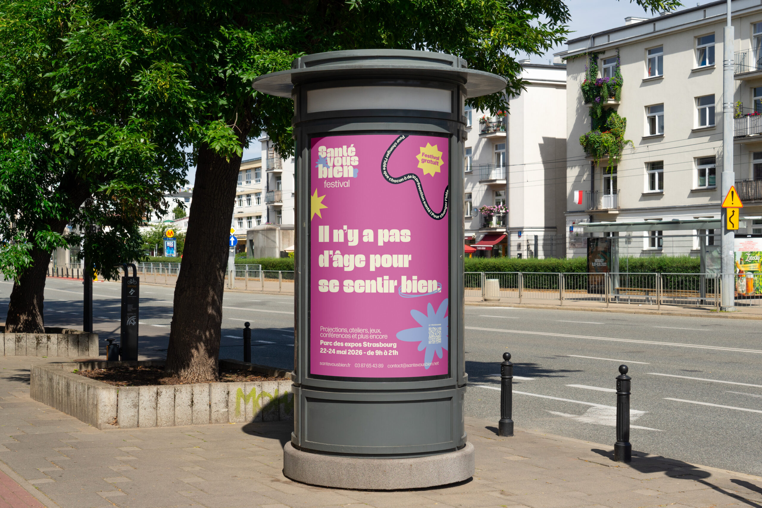
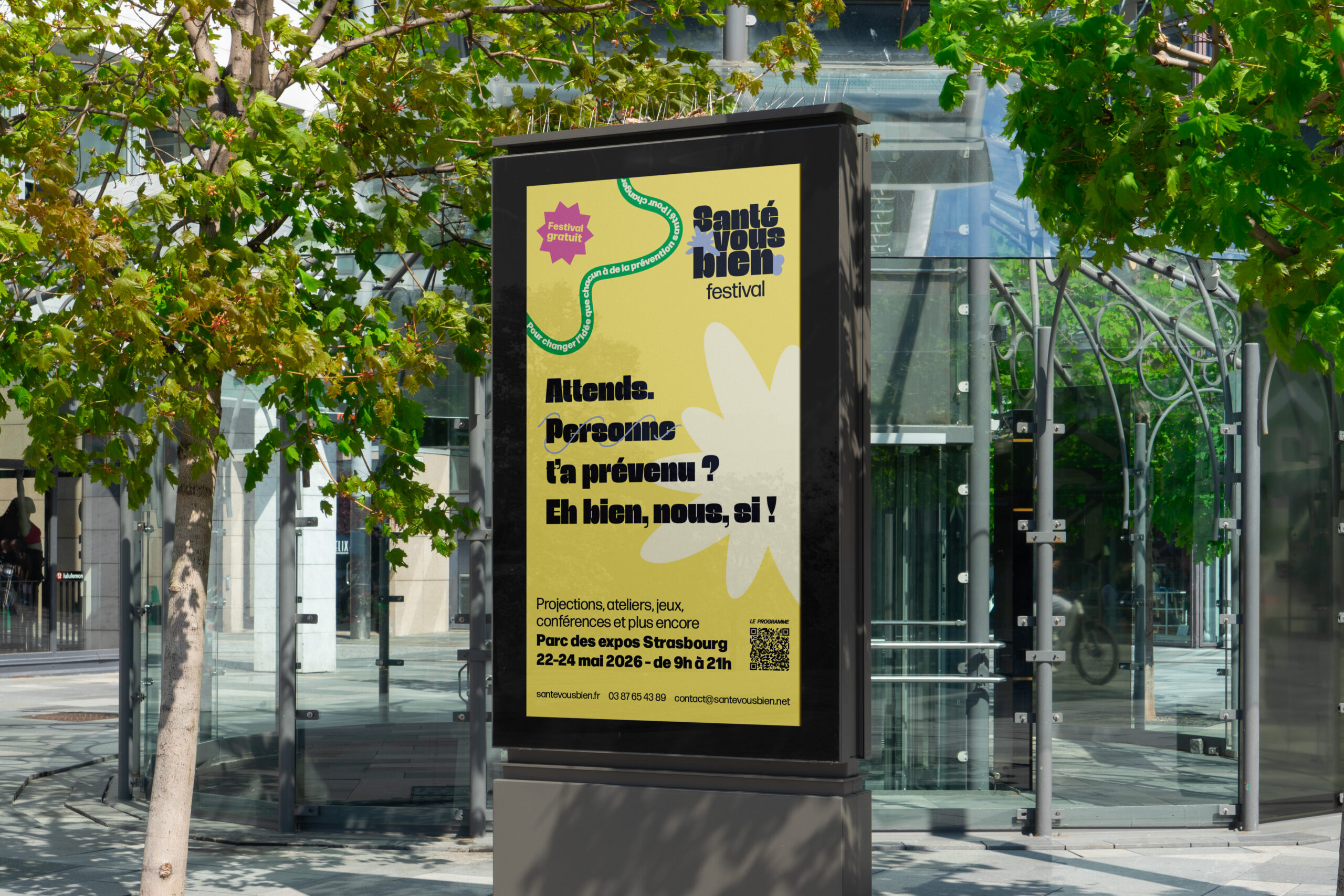
Pour promouvoir l’événement, nous avons conçu cinq affiches, chacune destinée à l’un des public ciblé.
Chaque affiche possède sa propre composition et un slogan adapté, pensés pour capter l’attention et encourager la participation.
Nous avons aussi imaginé le panneau d’accueil du festival, visible dès l’entrée, pour renforcer l’identité visuelle de l’événement.
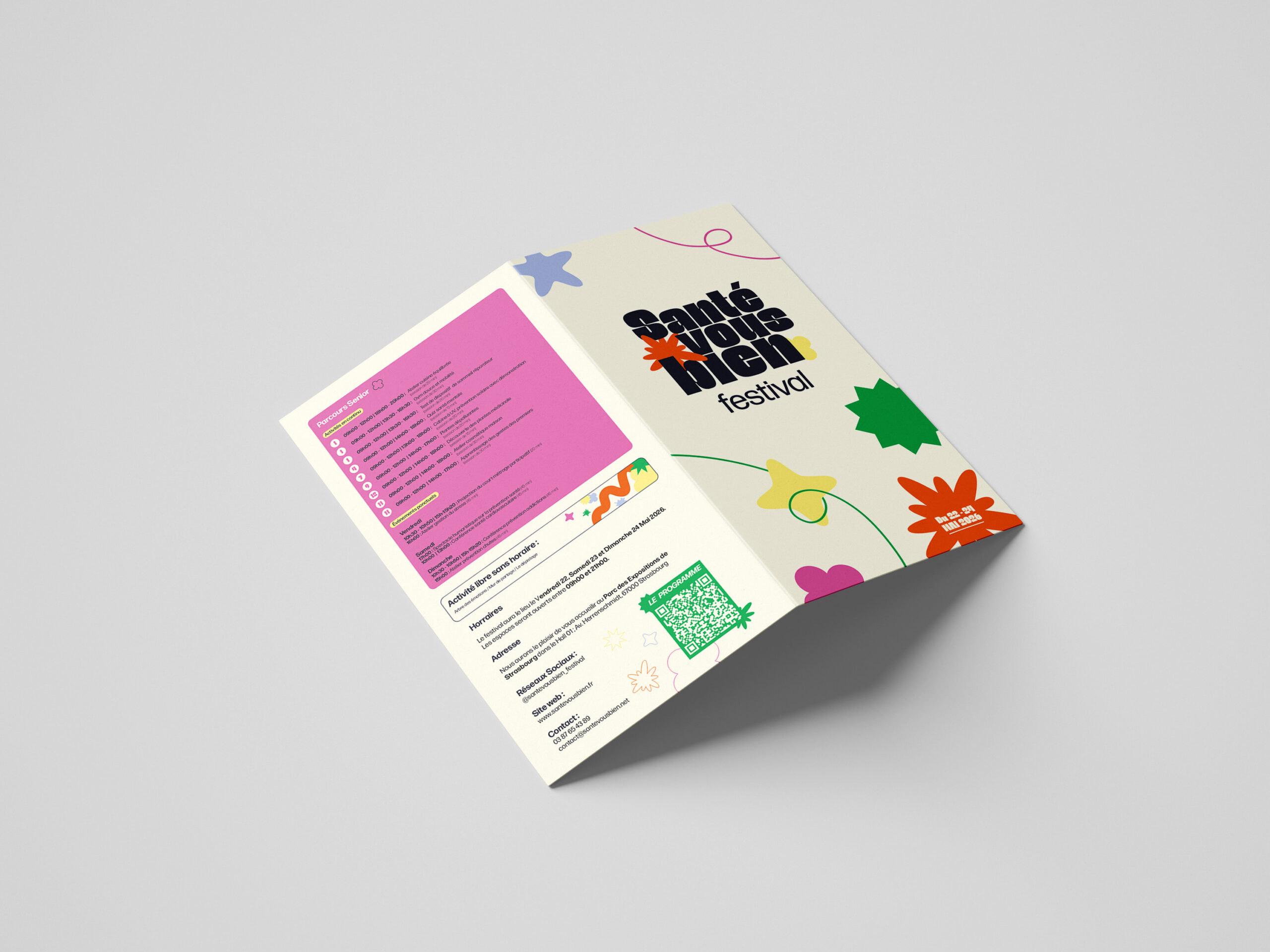
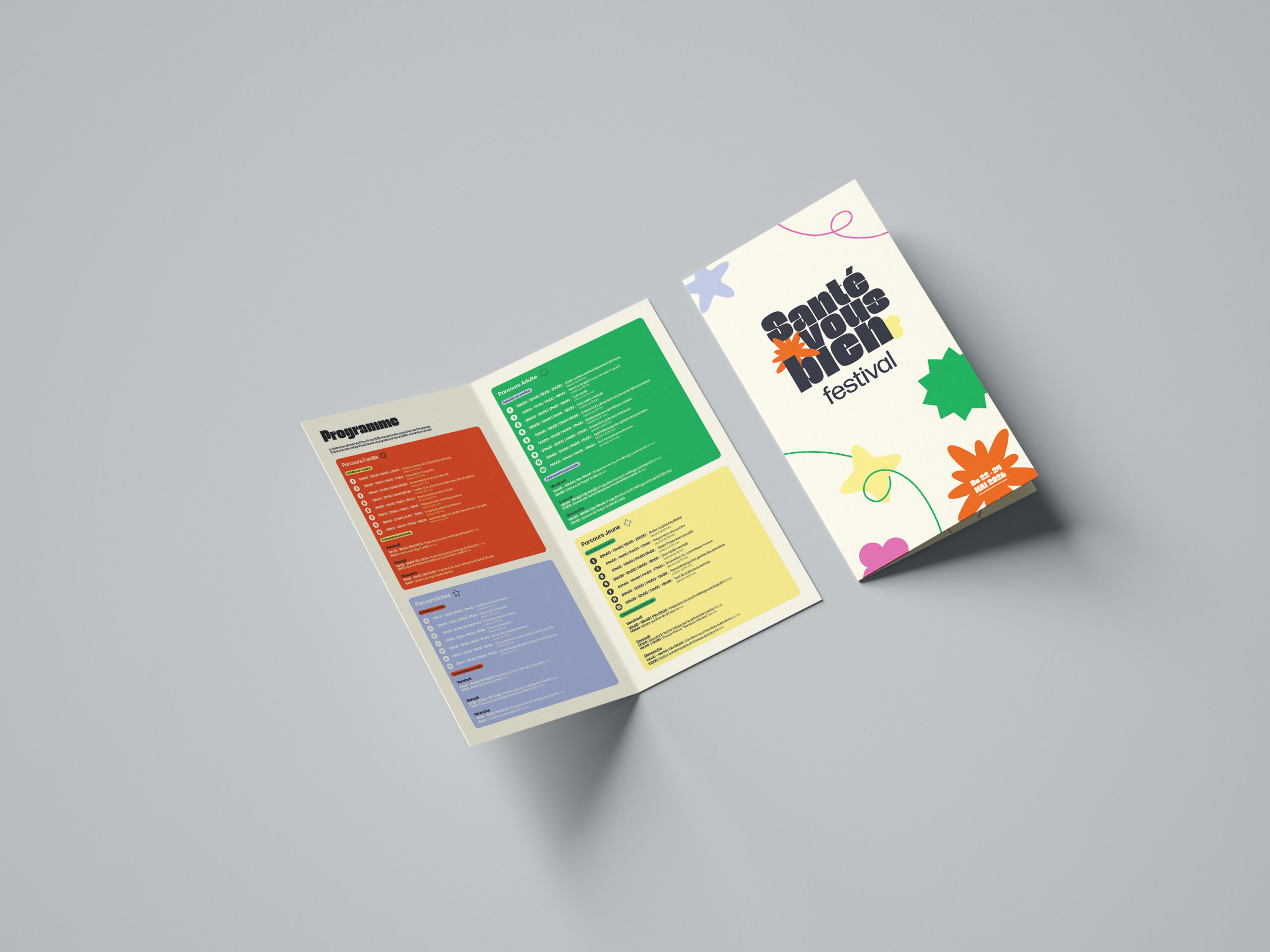
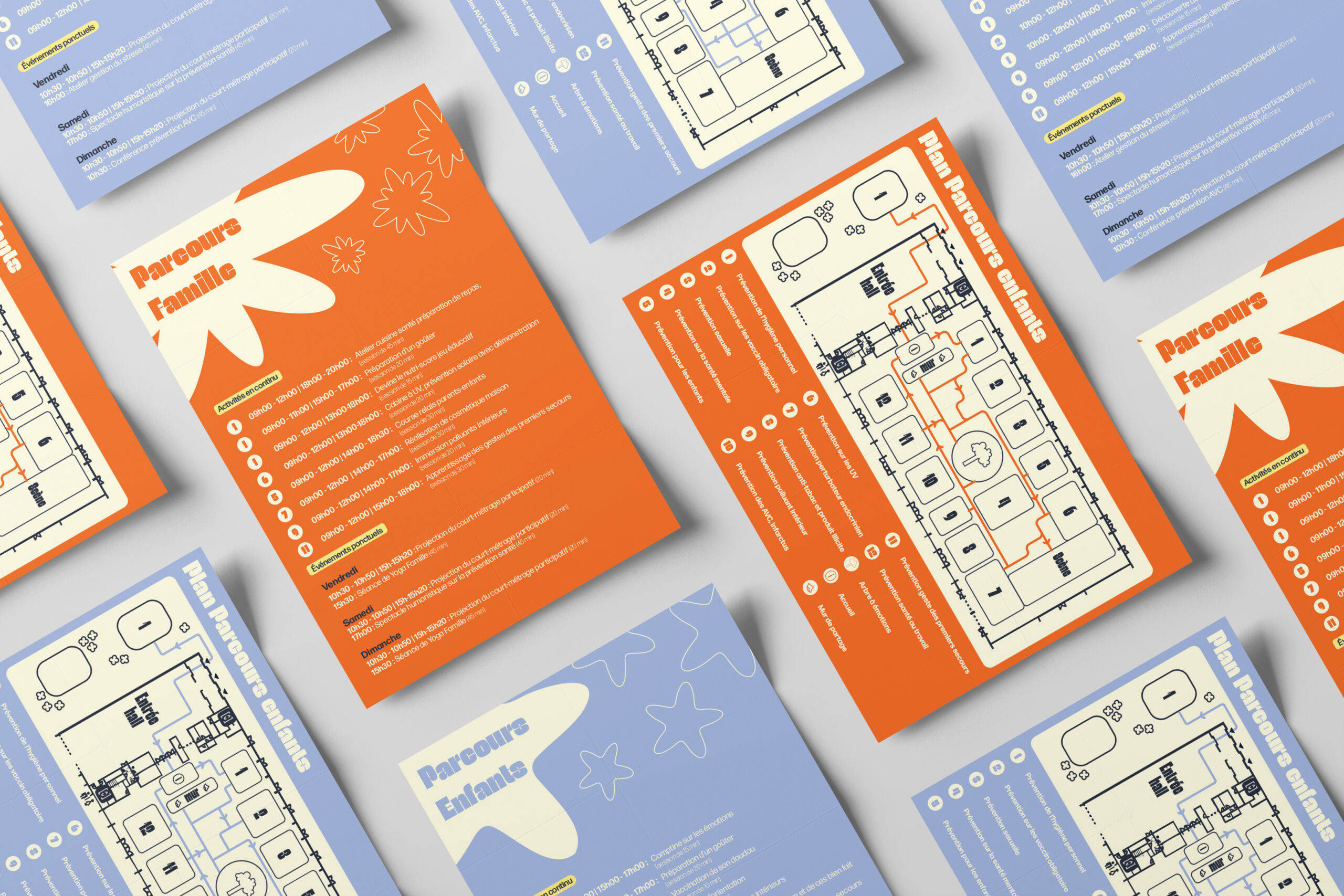
Pour orienter les visiteurs, deux brochures ont été créées :
– Une brochure générale présentant les cinq parcours, les activités et les temps forts de l’événement.
– Une brochure spécifique pour chaque parcours, avec un contenu ciblé selon le public concerné.
To promote the event, we designed five posters, each aimed at a different target audience.
Each poster has its own composition and slogan, designed to capture attention and encourage participation.
We also designed the festival’s welcome panel, visible from the entrance, to reinforce the event’s visual identity.
To help visitors find their way around, two brochures were created:
A general brochure presenting the five routes, the activities and the highlights of the event.
A specific brochure for each route, with content targeted to the audience concerned.
Présentation
Visuels 3D
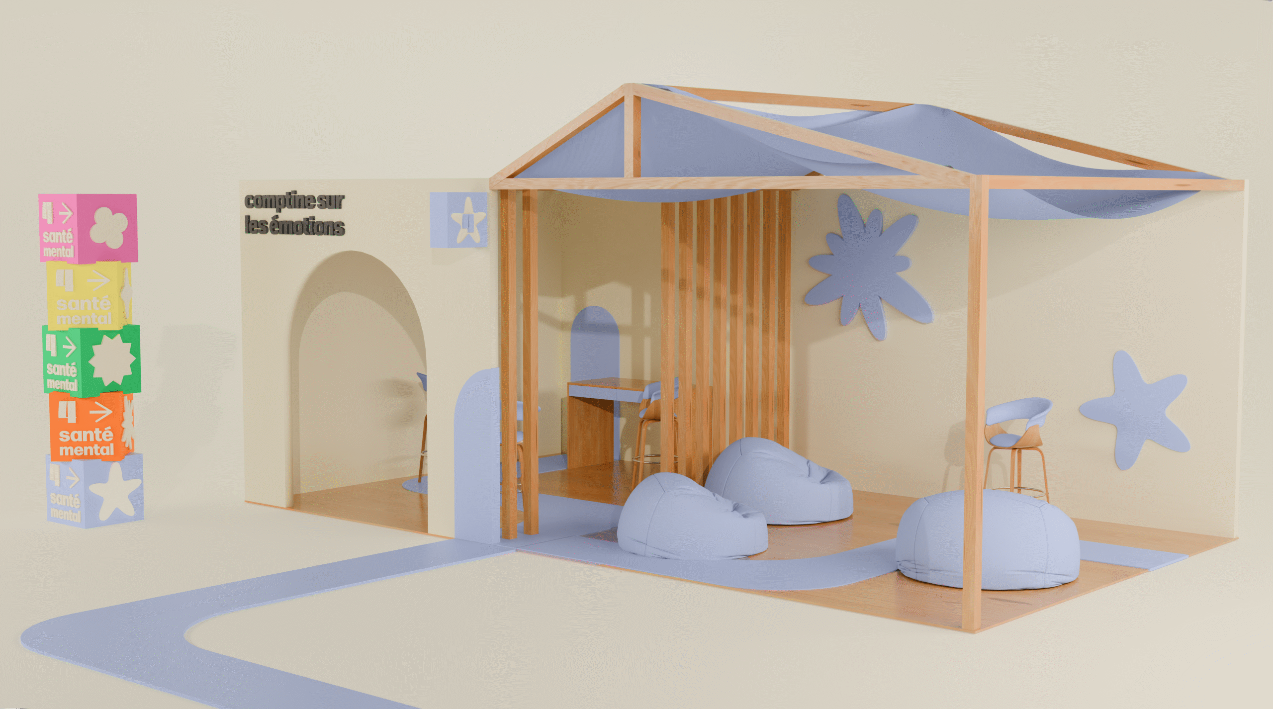
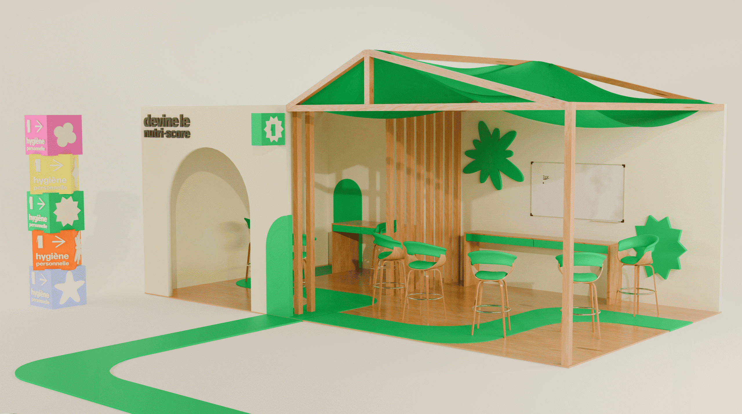
Dans le cadre de ce projet, j’ai réalisé les visuels 3D des stands, adaptés à chacun des cinq parcours.
Chaque stand reprend la couleur et l’agencement correspondant à son public et aux activités proposées.
Un totem de signalétique, reprenant les formes et couleurs des parcours, a également été imaginé pour aider les visiteurs à s’orienter facilement.
J’ai aussi modélisé deux installations phares du festival que nous avons conçues :
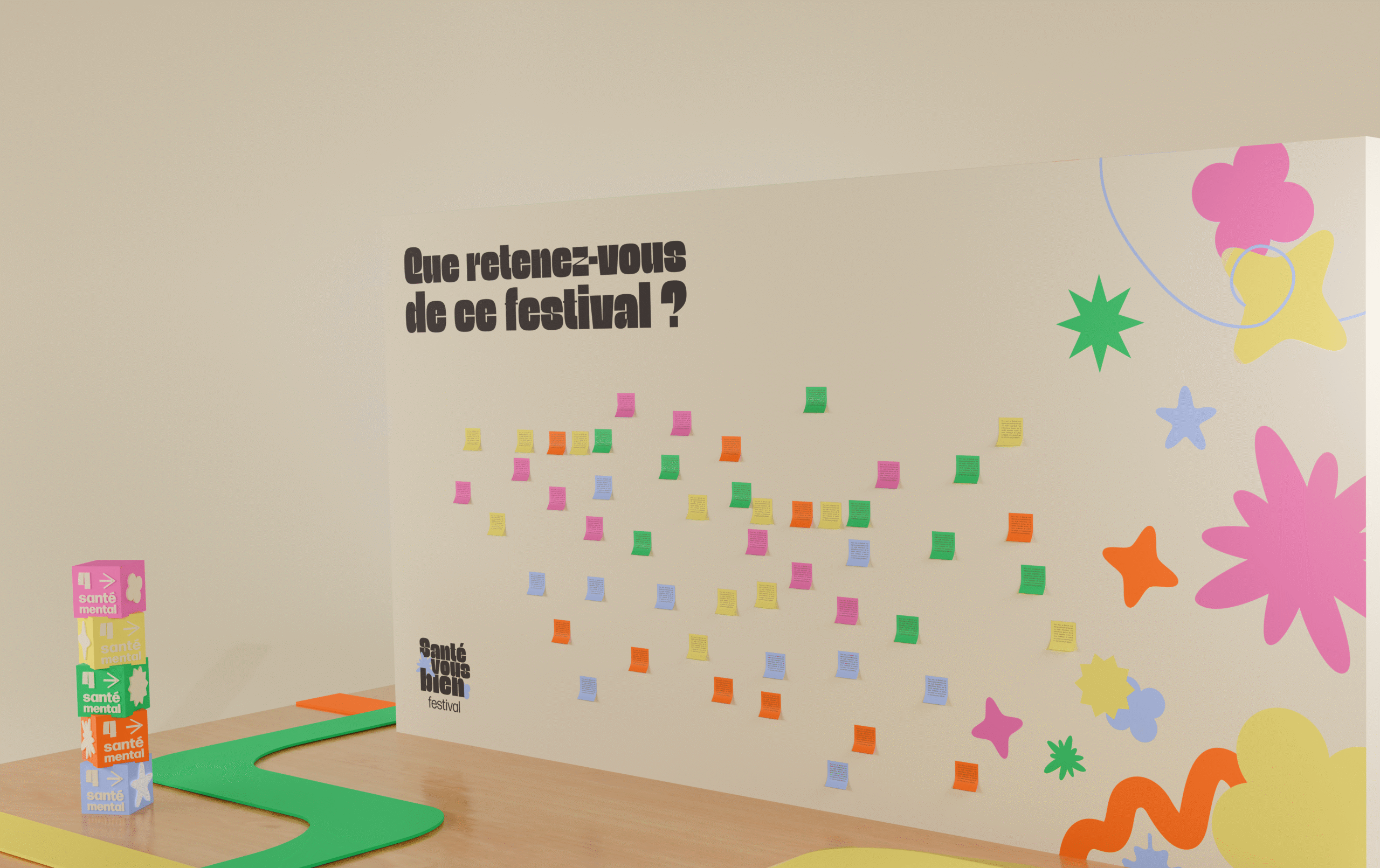
– Le mur à post-it : chaque visiteur y inscrit ce qu’il retient du festival sur un post-it aux couleurs de son parcours.
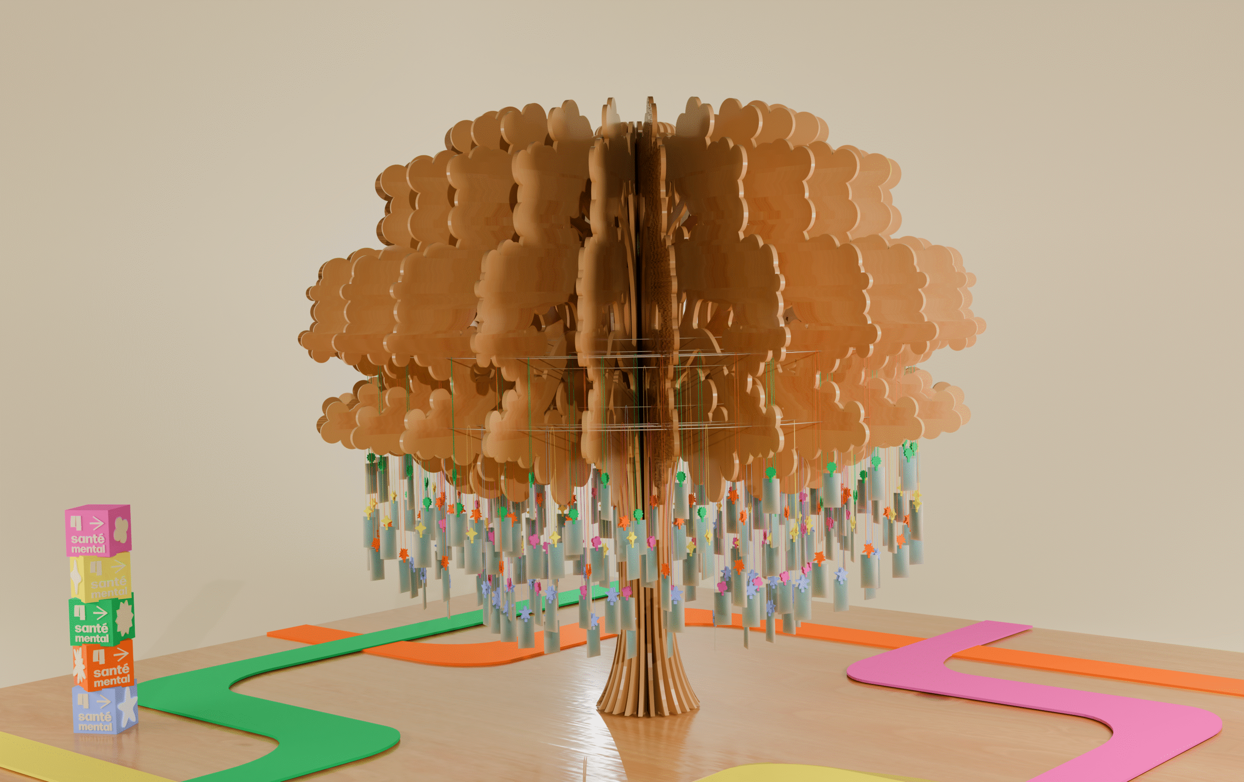
– L’arbre des émotions : installé au centre du hall, il invite chacun à accrocher un mot décrivant son ressenti. Une œuvre collective et évolutive, construite tout au long de l’événement.
As part of this project, I designed the 3D visuals for the stands, adapted to each of the five routes.
Each stand has been given a colour and layout to match its audience and the activities on offer.
A signage totem, using the shapes and colours of the routes, was also designed to help visitors find their way around easily.
I also modelled two of the festival’s key installations, which we designed:
The post-it wall: each visitor writes down what they remember about the festival on a post-it note in the colours of their route.
The tree of emotions: installed in the centre of the hall, it invites everyone to hang up a word describing their feelings. It’s a collective, evolving work, built up over the course of the event.