COLLAB
The North Face est une marque spécialisée dans les vêtements techniques pour les sports de montagne et d’endurance.
Paula Scher est une graphiste américaine reconnue pour son travail typographique audacieux, influencé par l’Art déco et le constructivisme russe. Membre du studio Pentagram, elle est à l’origine de nombreuses identités visuelles iconiques.
Dans le cadre d’un workshop, il m’a été demandé d’imaginer une collaboration fictive entre The North Face et Paula Scher — deux références imposées. Le projet incluait la création d’une collection de vêtements, d’un événement dédié avec ses supports imprimés (affiches, signalétique, invitations), ainsi que d’une communication en ligne.
The North Face is a brand specialising in technical clothing for mountain and endurance sports.
Paula Scher is an American graphic designer renowned for her bold typographic work, influenced by Art Deco and Russian Constructivism. A member of the Pentagram studio, she has created many iconic visual identities.
As part of a workshop, I was asked to imagine a fictional collaboration between The North Face and Paula Scher – two imposed references. The project included the creation of a clothing collection, a dedicated event with printed materials (posters, signage, invitations) and online communication.
DATE
2023
CLIENT
Projet d’école
LOGICIELS
Illustrator | Photoshop | Indesign | Procreate | Premier pro | Figma | Blender
Présentation
Identité visuelle
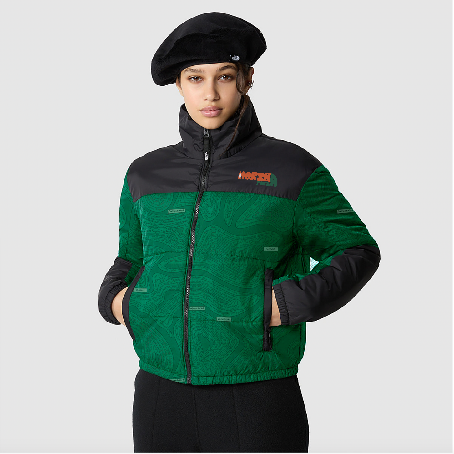
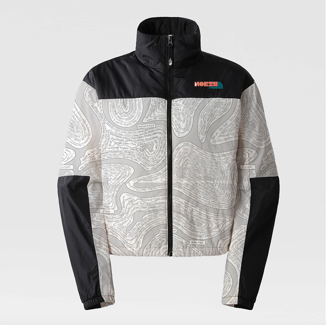
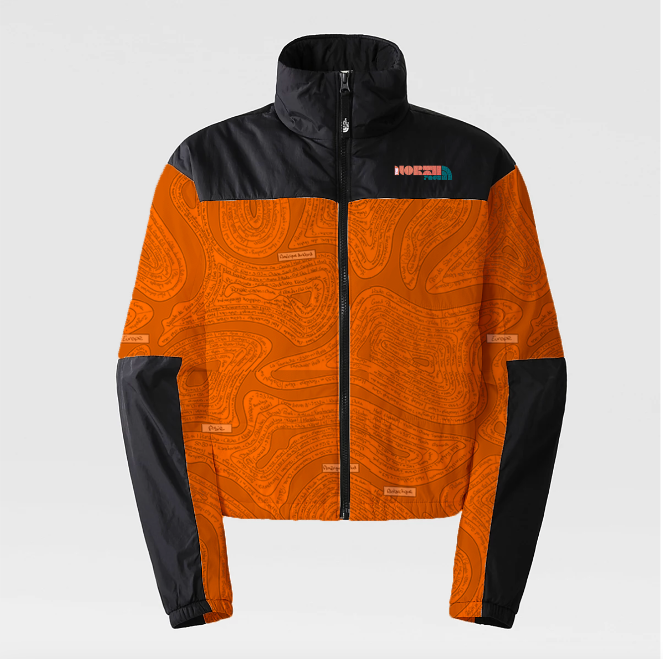
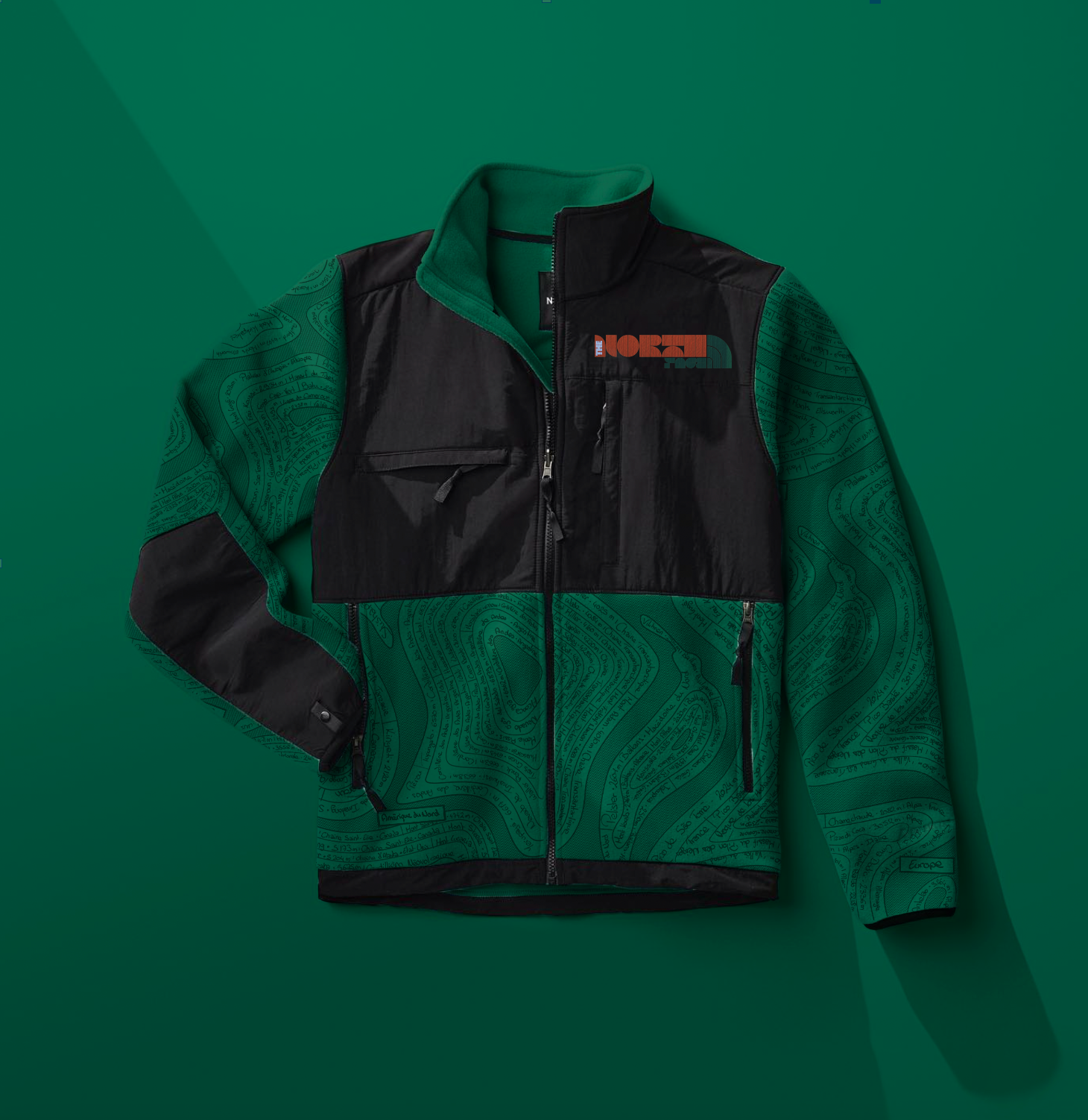
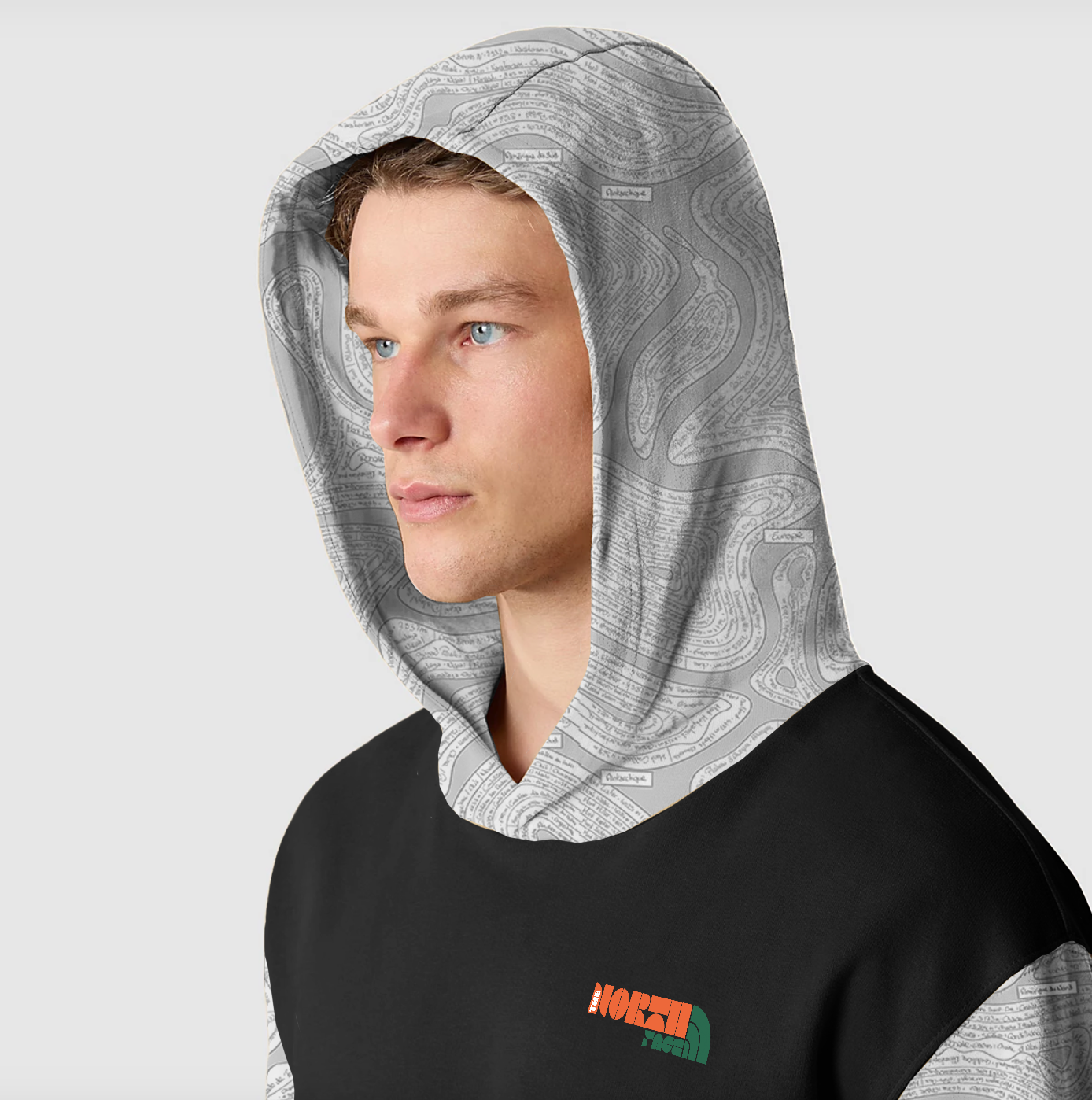
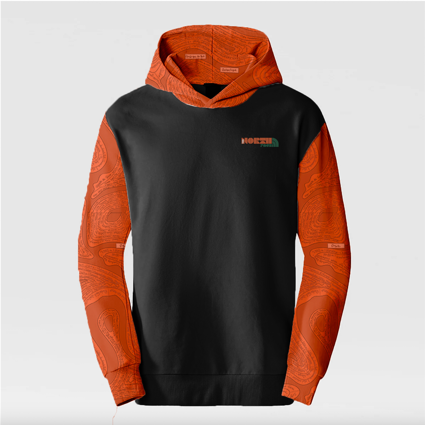
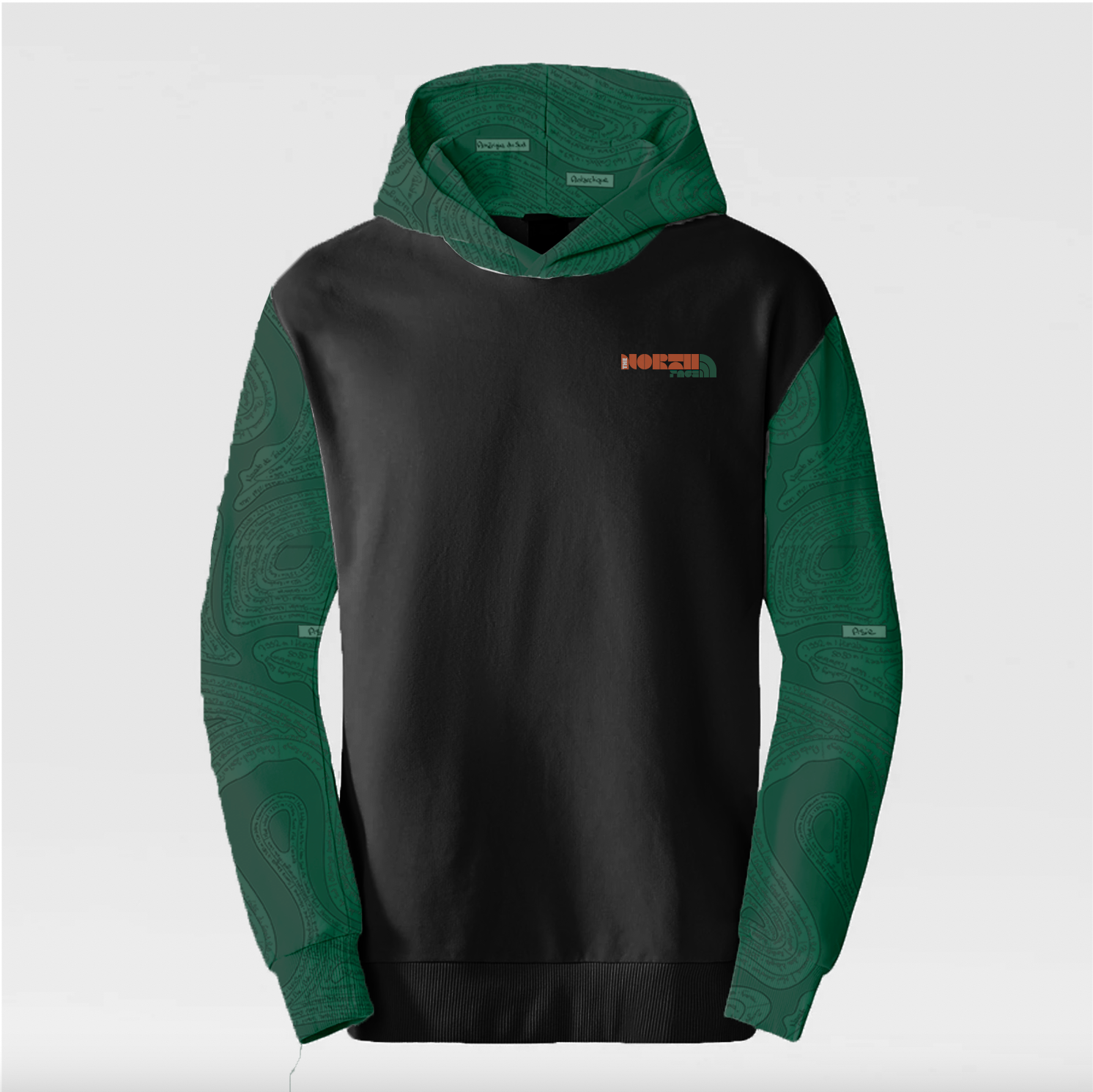
J’ai imaginé une refonte du logo de The North Face dans l’esprit de Paula Scher, en utilisant une typographie bold et marquée, accompagnée de couleurs franches, en lien avec certains de ses projets graphiques.
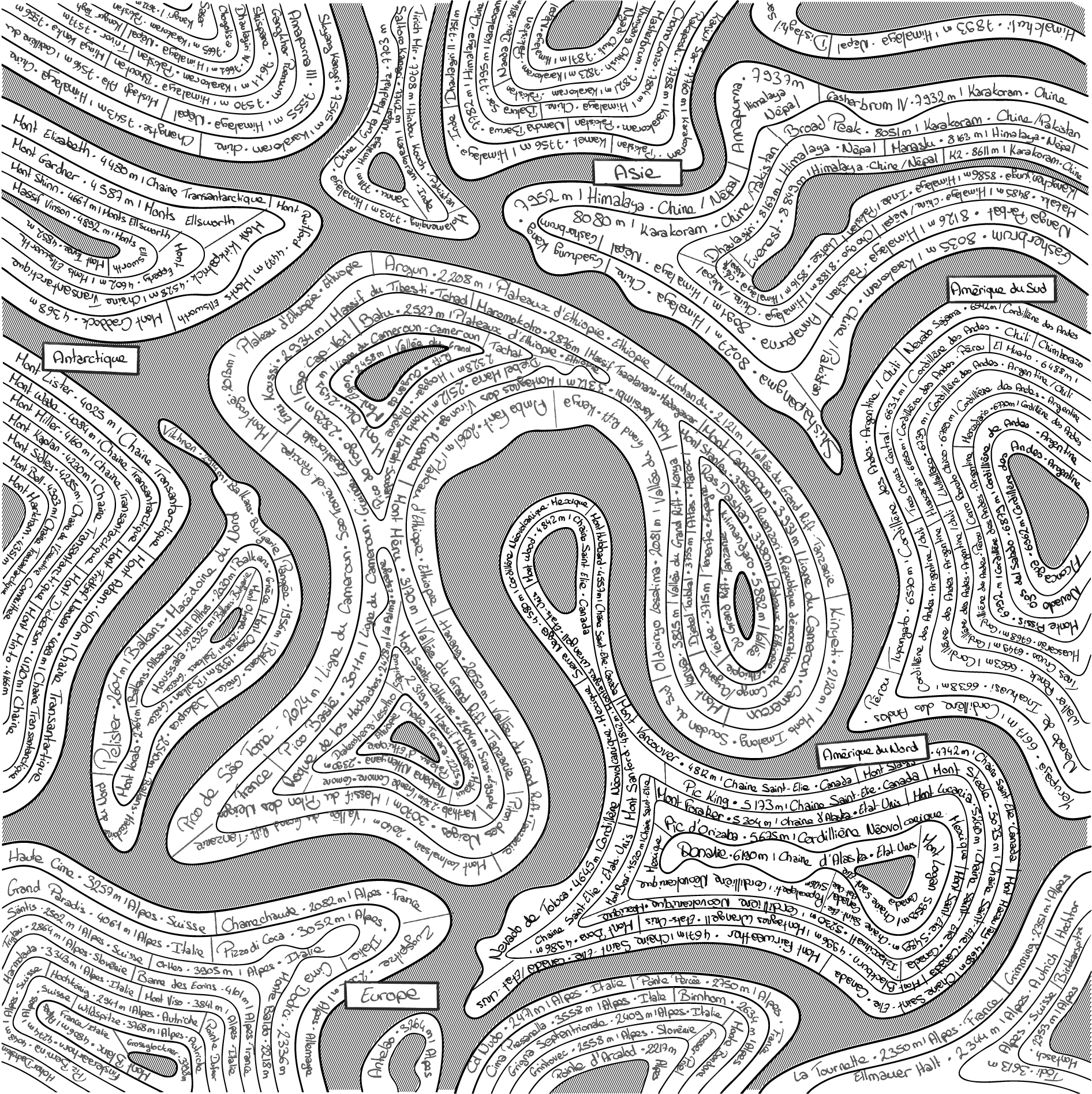
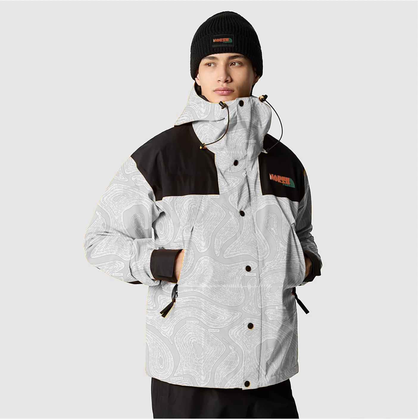
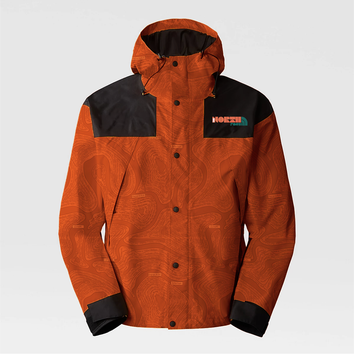
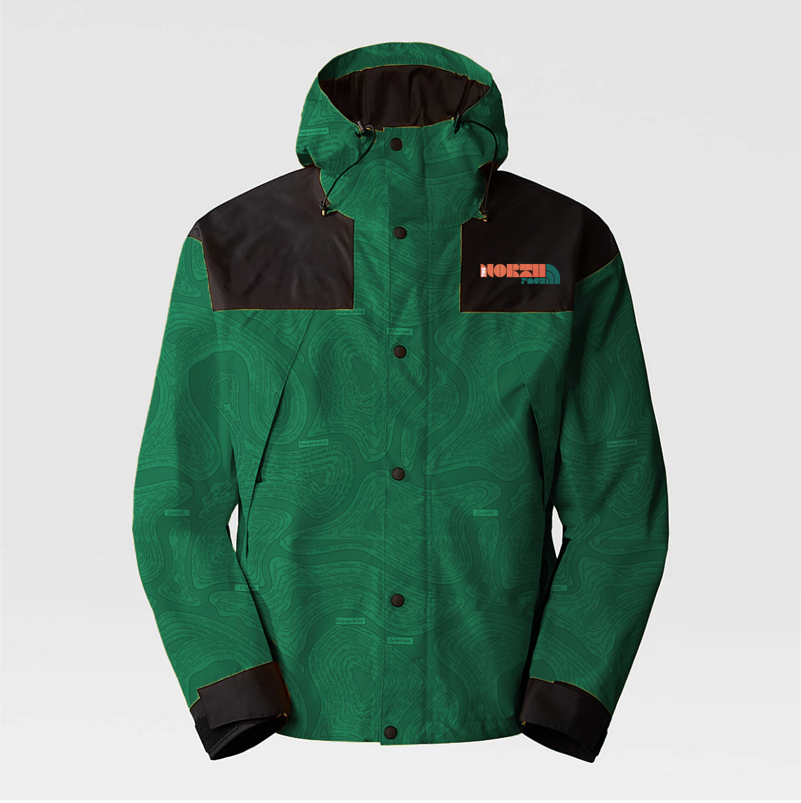
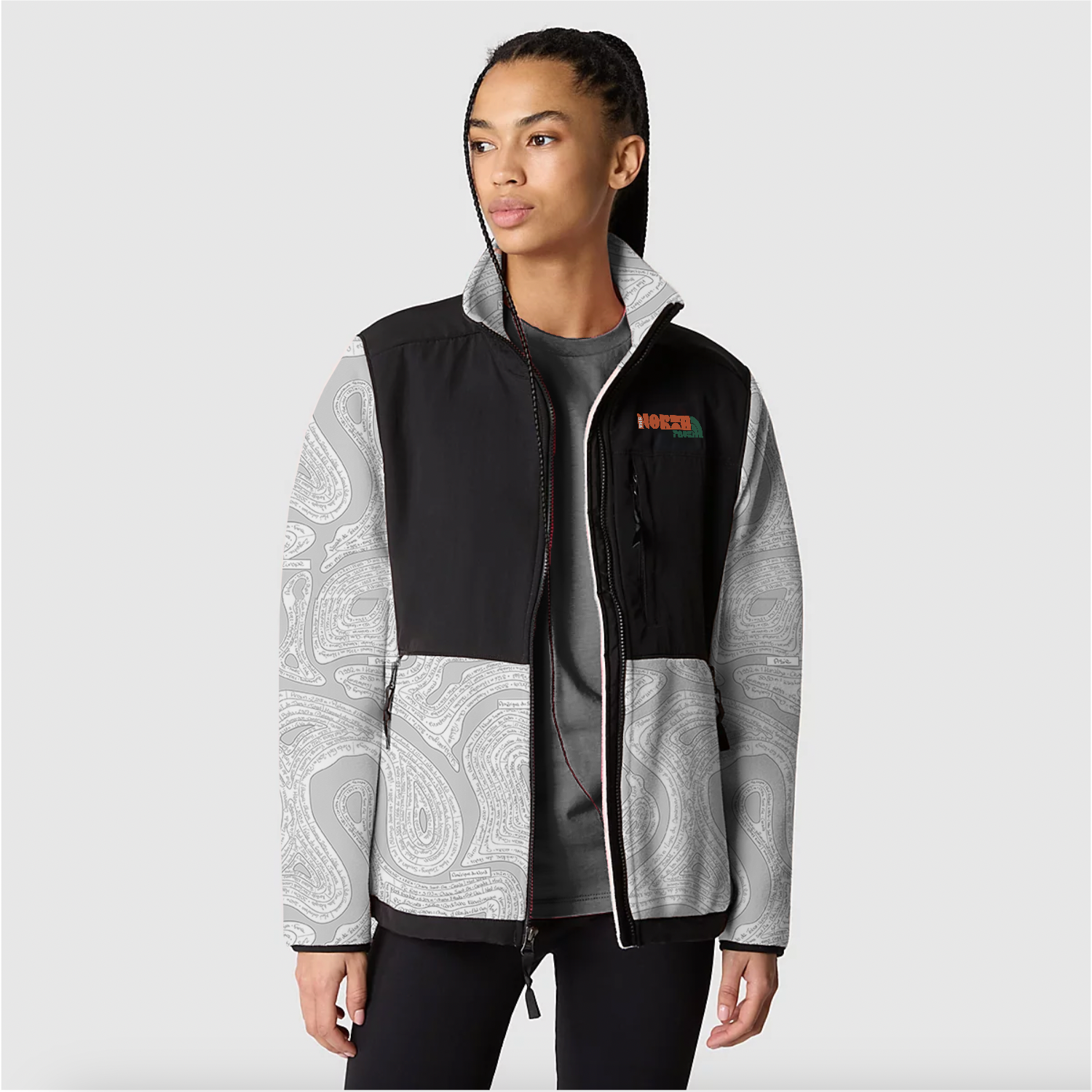
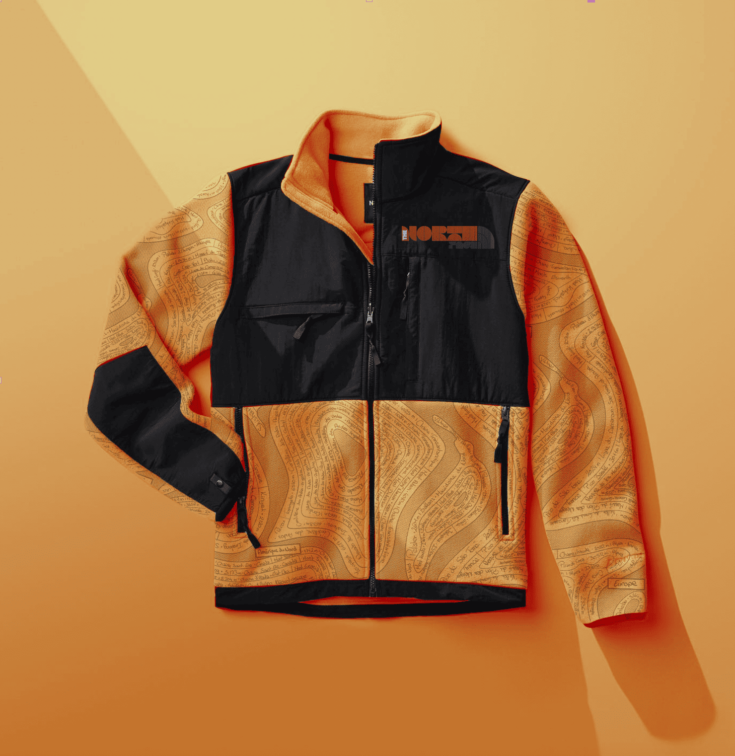
Au cœur de cette collaboration fictive : un motif typographique entièrement dessiné à la main, inspiré des cartes emblématiques de Paula Scher.
Ces cartes représentent des territoires uniquement par la typographie, mêlant noms de lieux, données géographiques et autres informations.
J’ai donc créé une carte topographique typographique des montagnes du monde, où sont inscrits les noms des sommets, leur altitude, leur chaîne de montagne et leur pays.
Ce motif symbolise la rencontre entre l’univers exploratoire de The North Face et l’esthétique graphique forte et artisanale de Paula Scher.
I imagined a rebranding of The North Face logo in the spirit of Paula Scher, using bold typography and vivid colors, echoing some of her graphic work.
At the heart of this fictional collaboration is a fully hand-drawn typographic pattern, inspired by Paula Scher’s iconic maps.
These maps depict territories using only typography, blending place names, geographical data, and other information.
I created a typographic topographic map of the world’s mountains, featuring the name of each summit, its altitude, the mountain range it belongs to, and its country.
This design captures the meeting point between The North Face’s spirit of exploration and Paula Scher’s bold, handcrafted graphic style.
Présentation
Collection
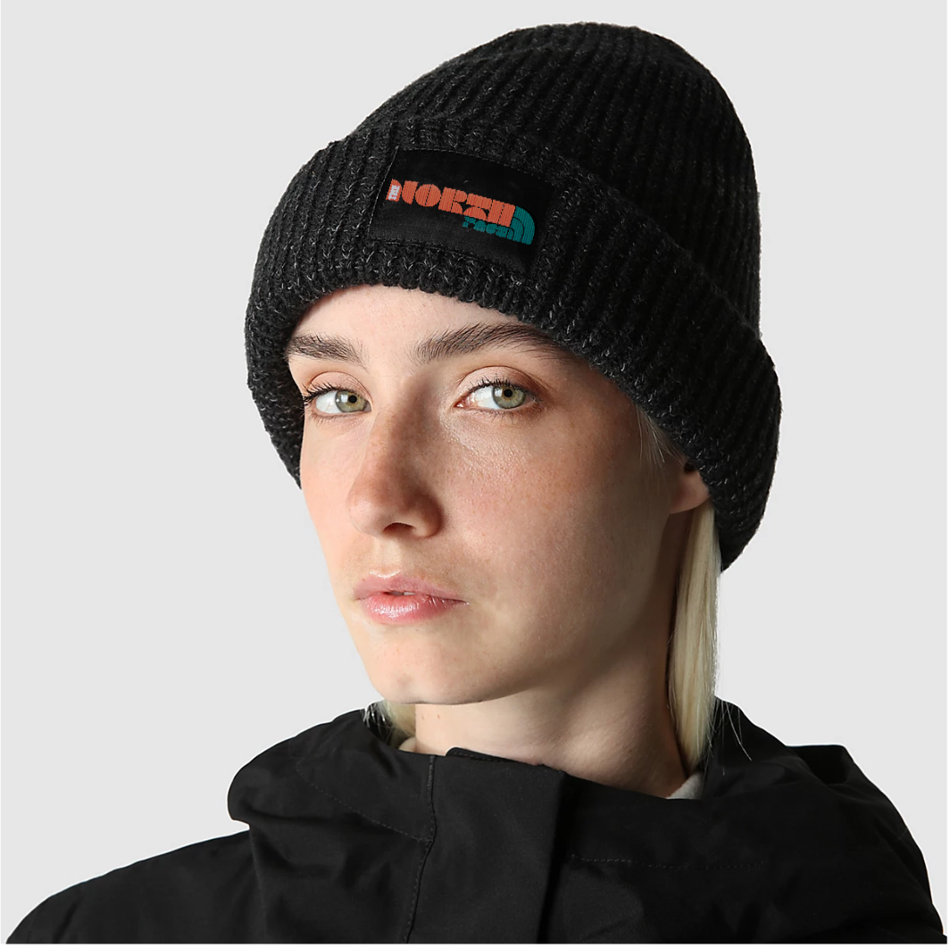
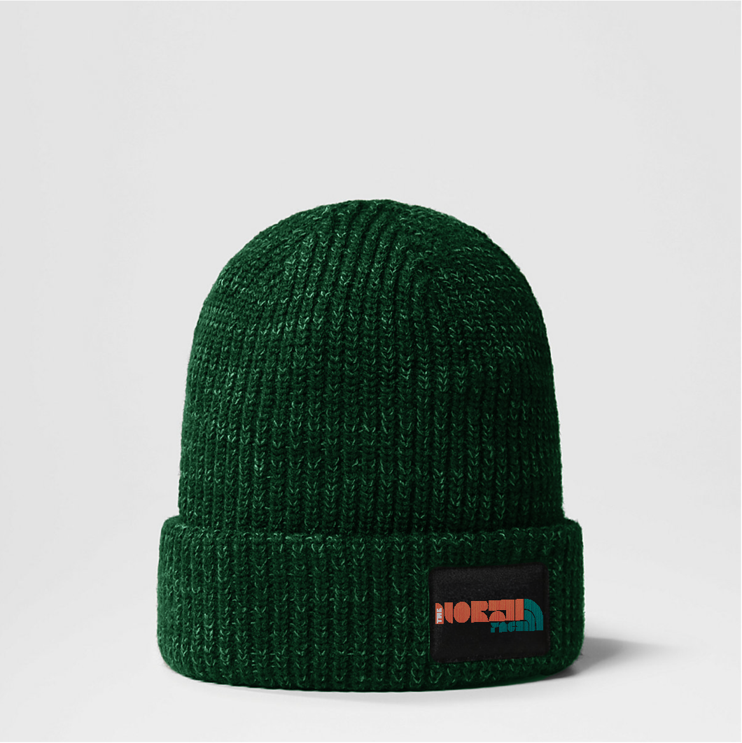
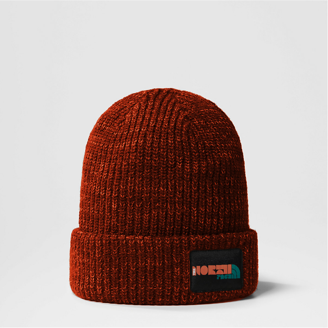
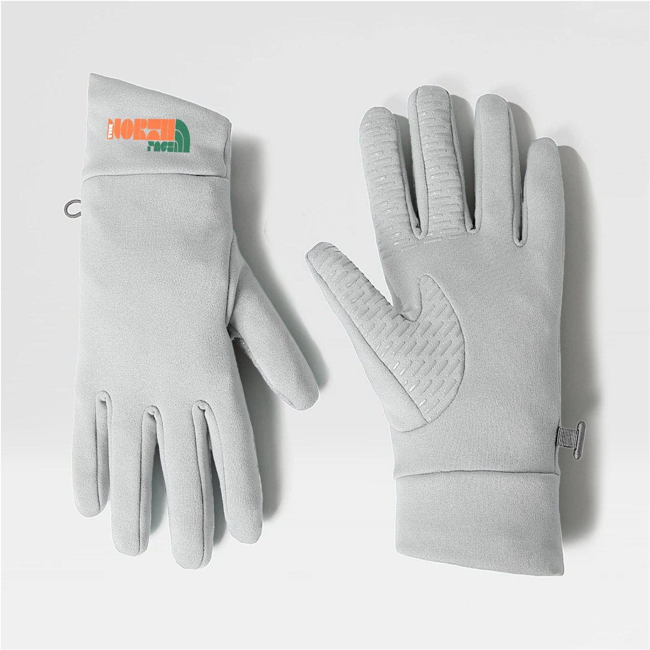
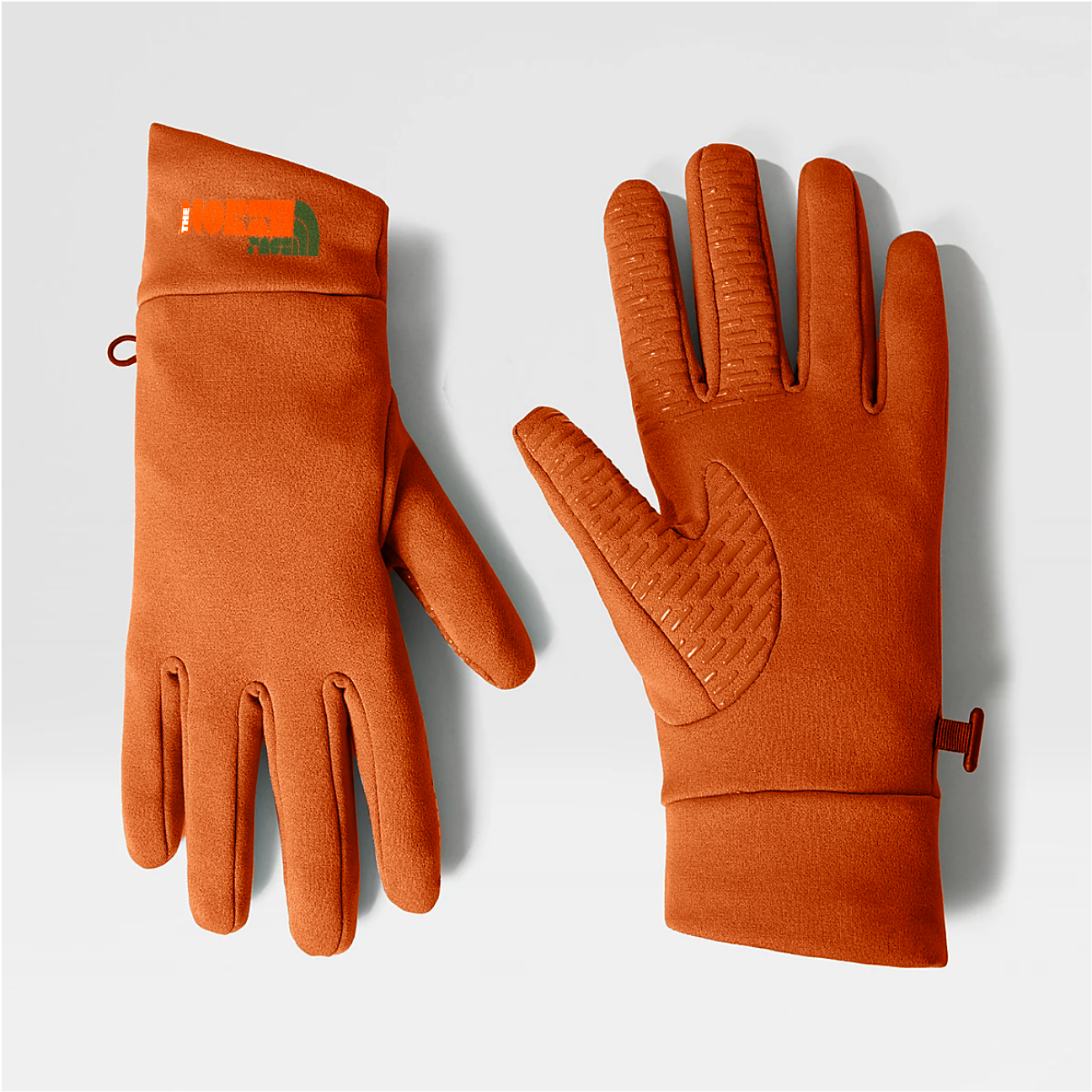
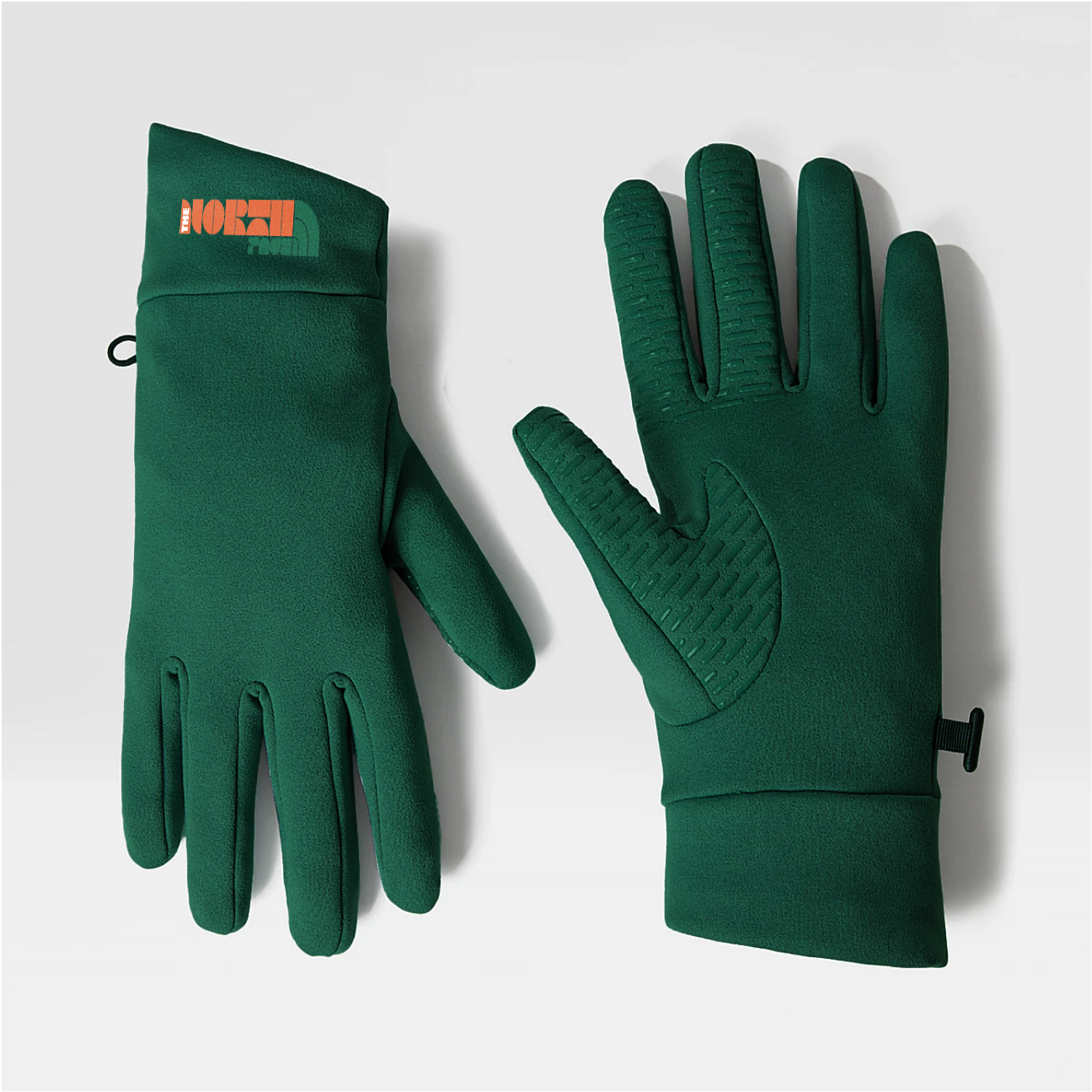
Réalisation de la collection. Celle-ci se compose de plusieurs pièces : un coupe-vent, une doudoune, un sweat, une polaire, un bonnet et des gants.
L’objectif était de proposer une gamme accessible, composée de modèles emblématiques de la marque, répartis sur différents niveaux de prix pour toucher un public large.
Chaque pièce est déclinée en trois couleurs (vert, orange et blanc), en cohérence avec la palette créée.
Creation of the collection. The collection includes several pieces : a windbreaker, a down jacket, a sweatshirt, a fleece, a beanie, and gloves.
The goal was to offer an accessible range, made up of classic items from the brand, spread across different price points to appeal to a broad audience.
Each piece comes in three colors : green, orange, and white reflecting the chosen color palette.
Présentation
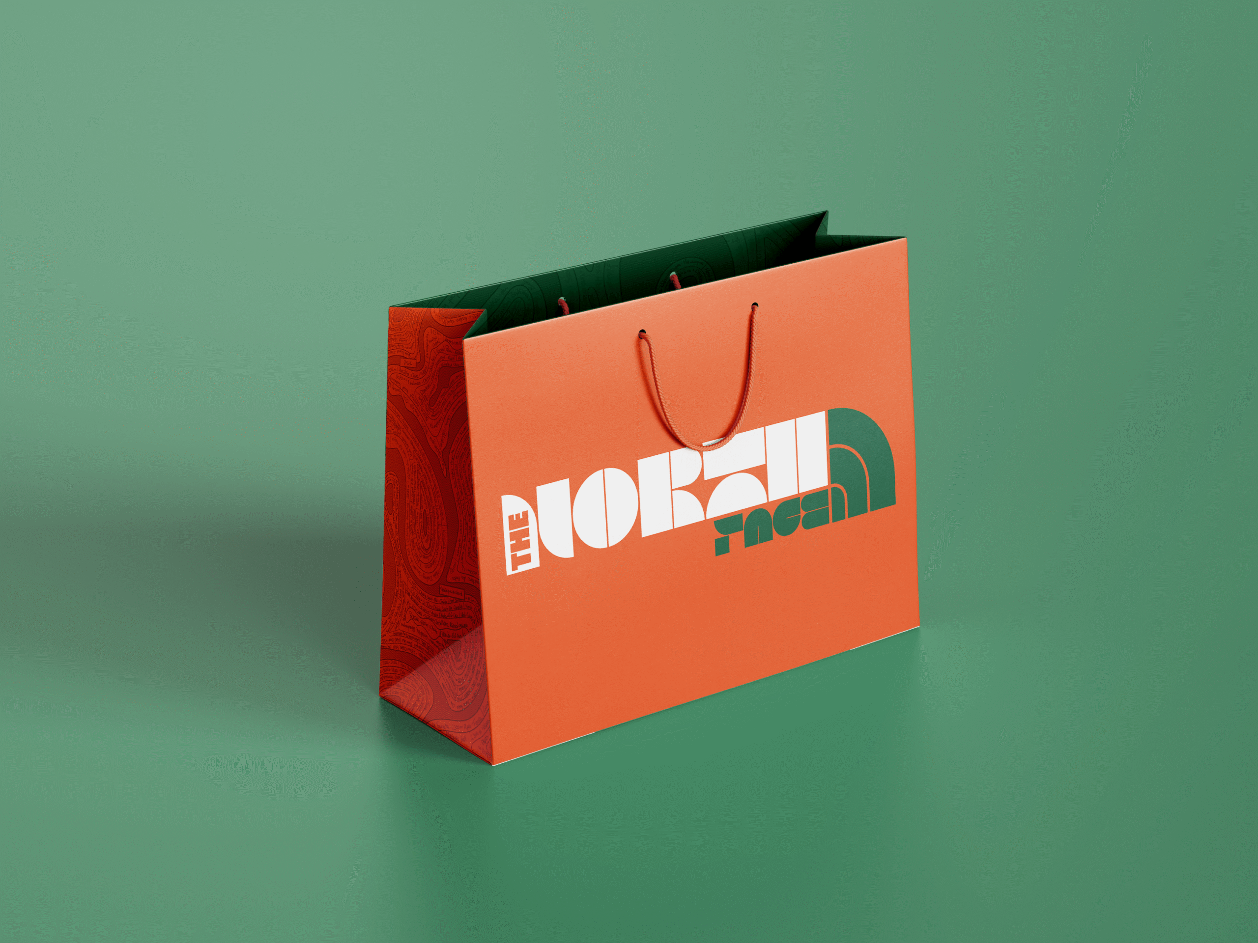
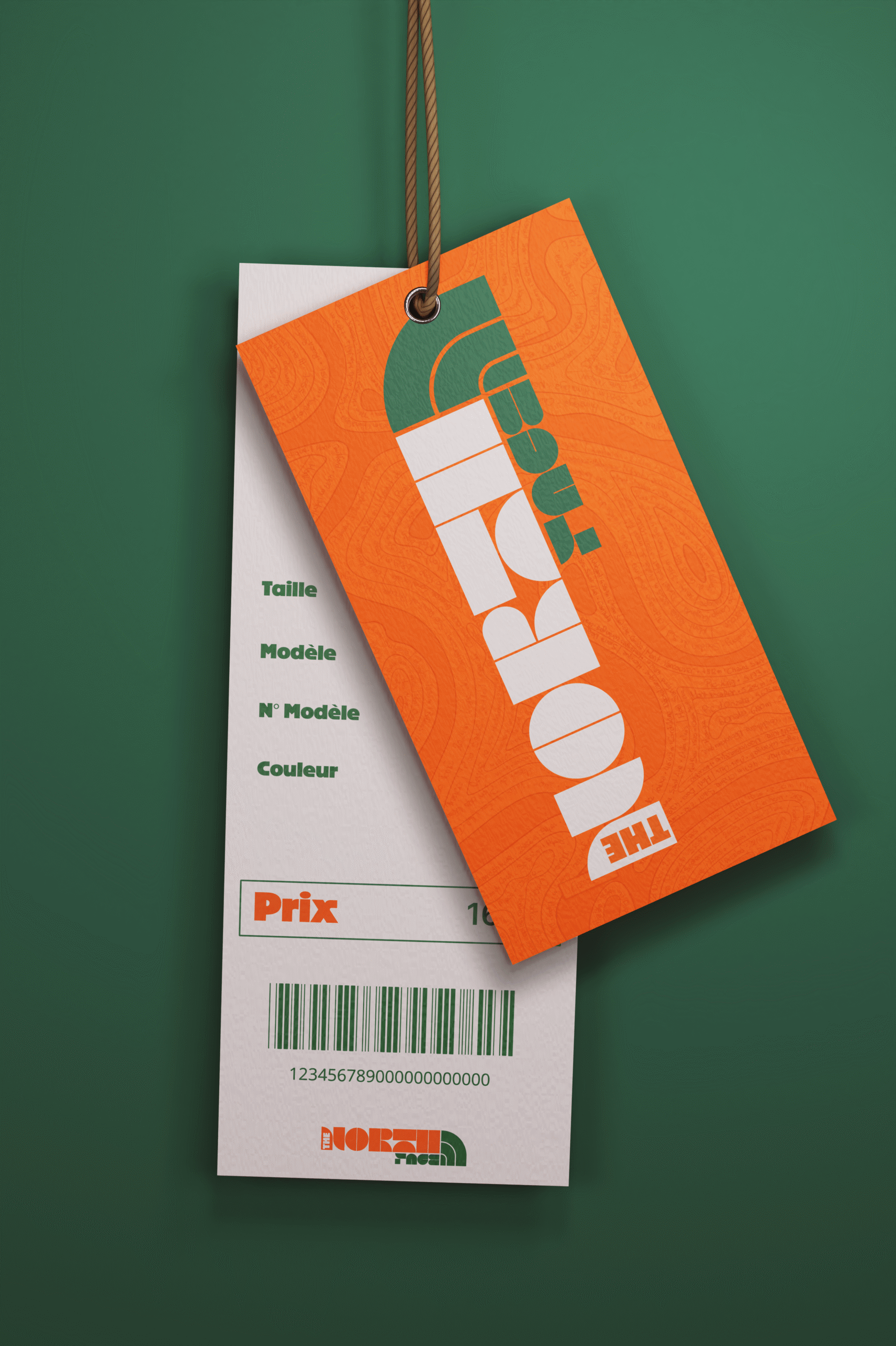
Sac & étiquette
La direction artistique s’étend également aux sacs et étiquettes produits, reprenant le motif et les couleurs de la collection. Chaque support a été pensé pour prolonger l’univers graphique de la collab.
The artistic direction also extends to the bags and product labels, using the motif and colours of the collection. Each medium has been designed to extend the graphic universe of the collab.
Présentation
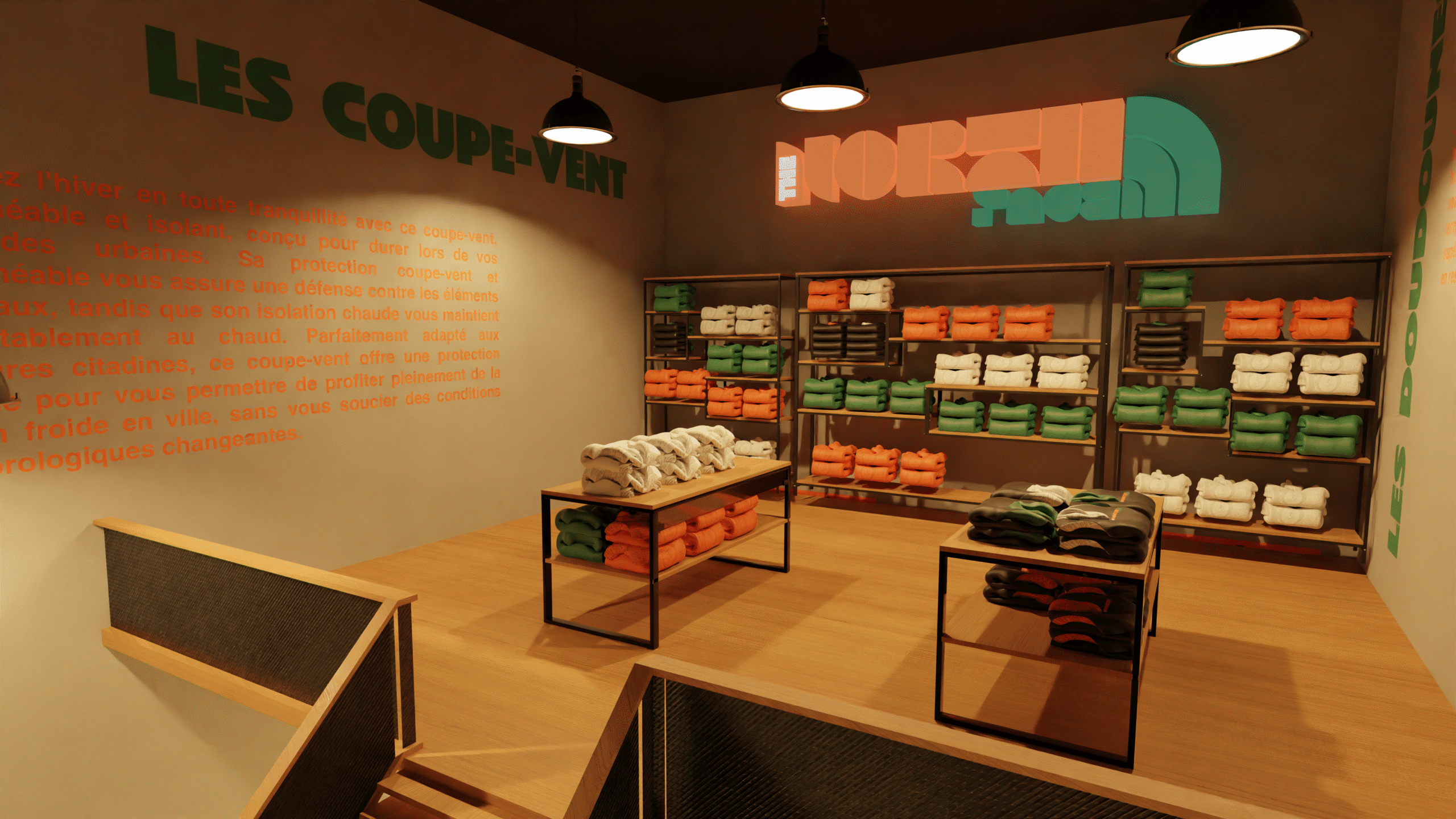
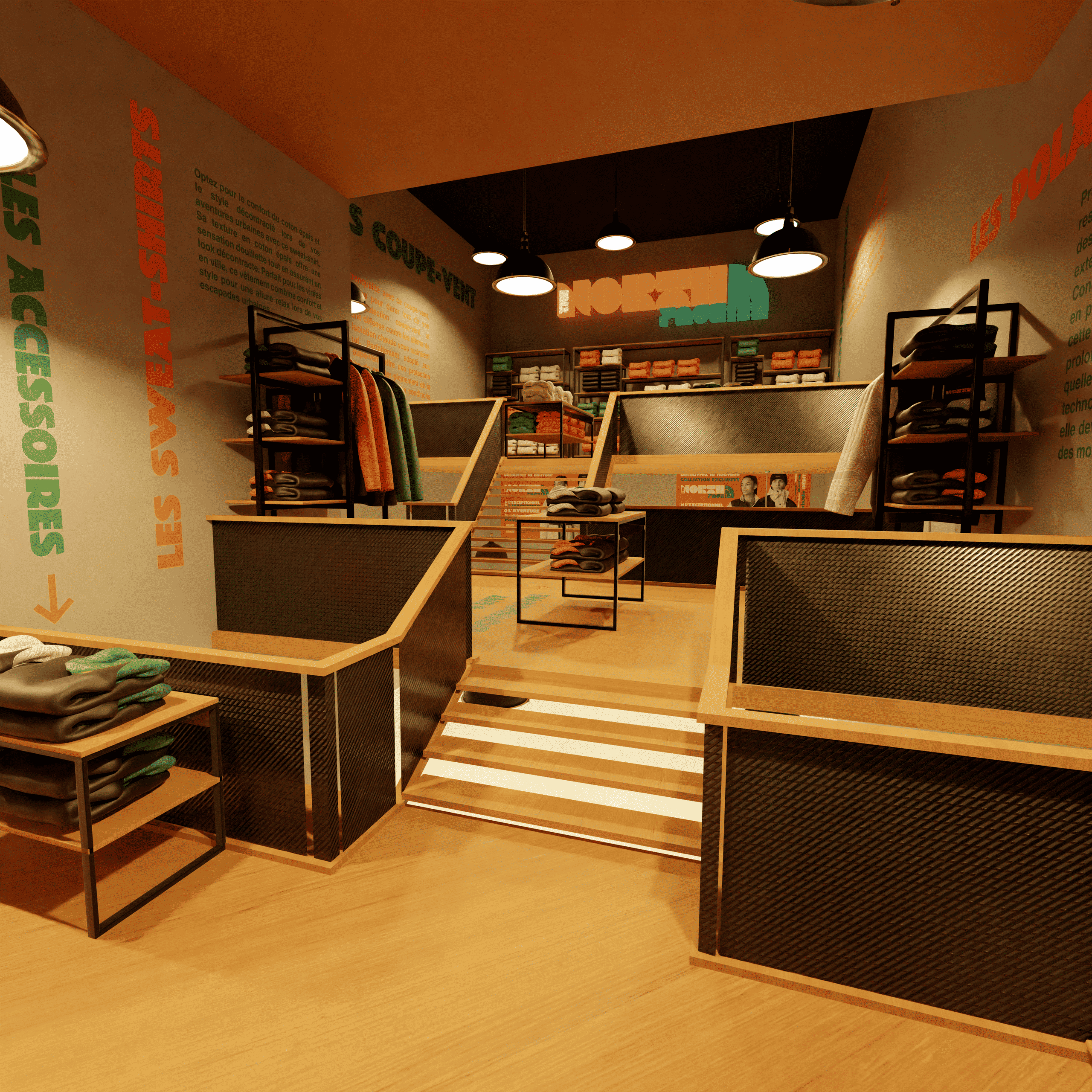
Event
L’événement de lancement a lieu dans la boutique The North Face de Chamonix.
La scénographie s’inspire des installations immersives de Paula Scher, avec une signalétique typographique directement apposée sur les murs et le sol.
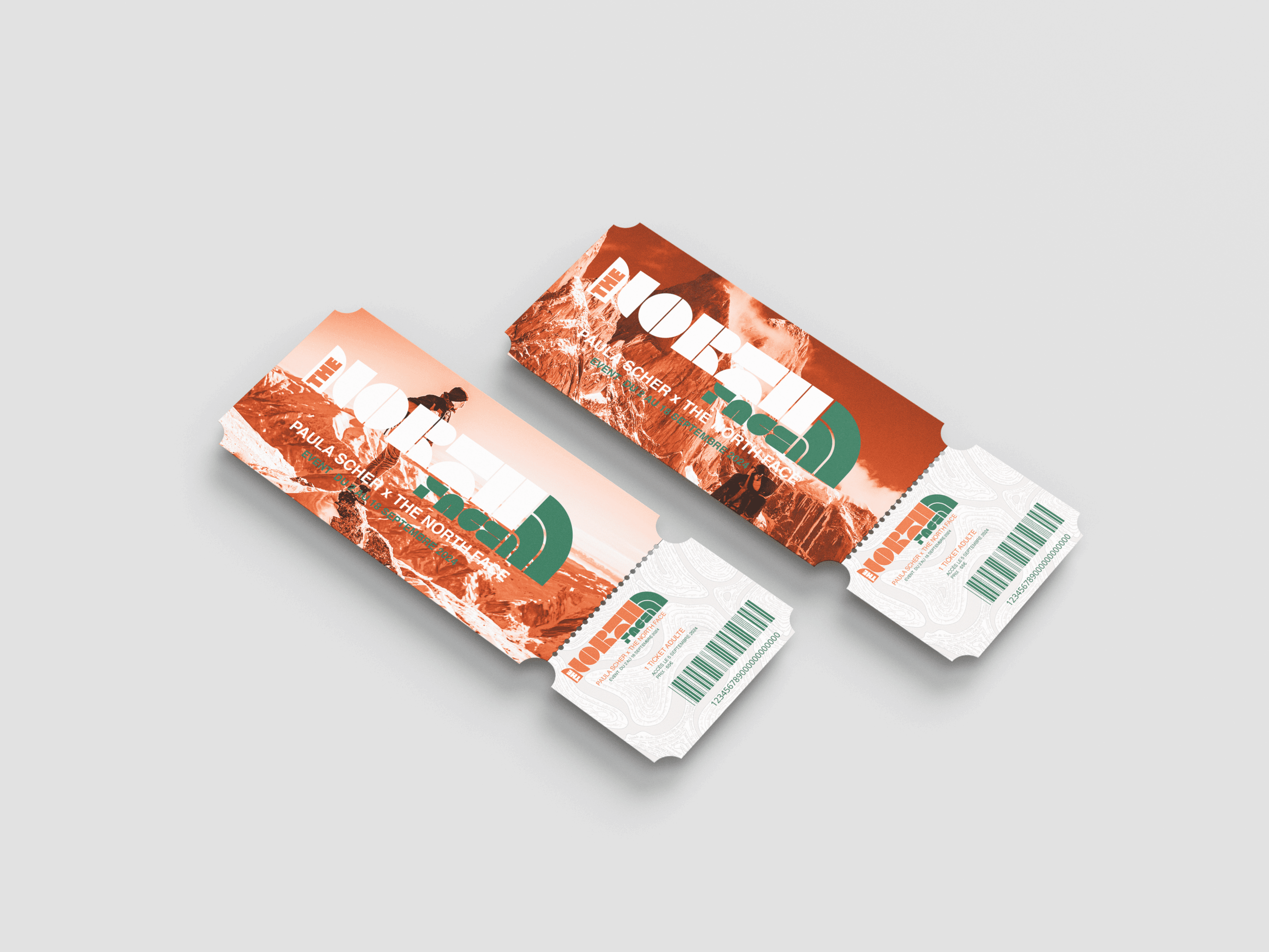
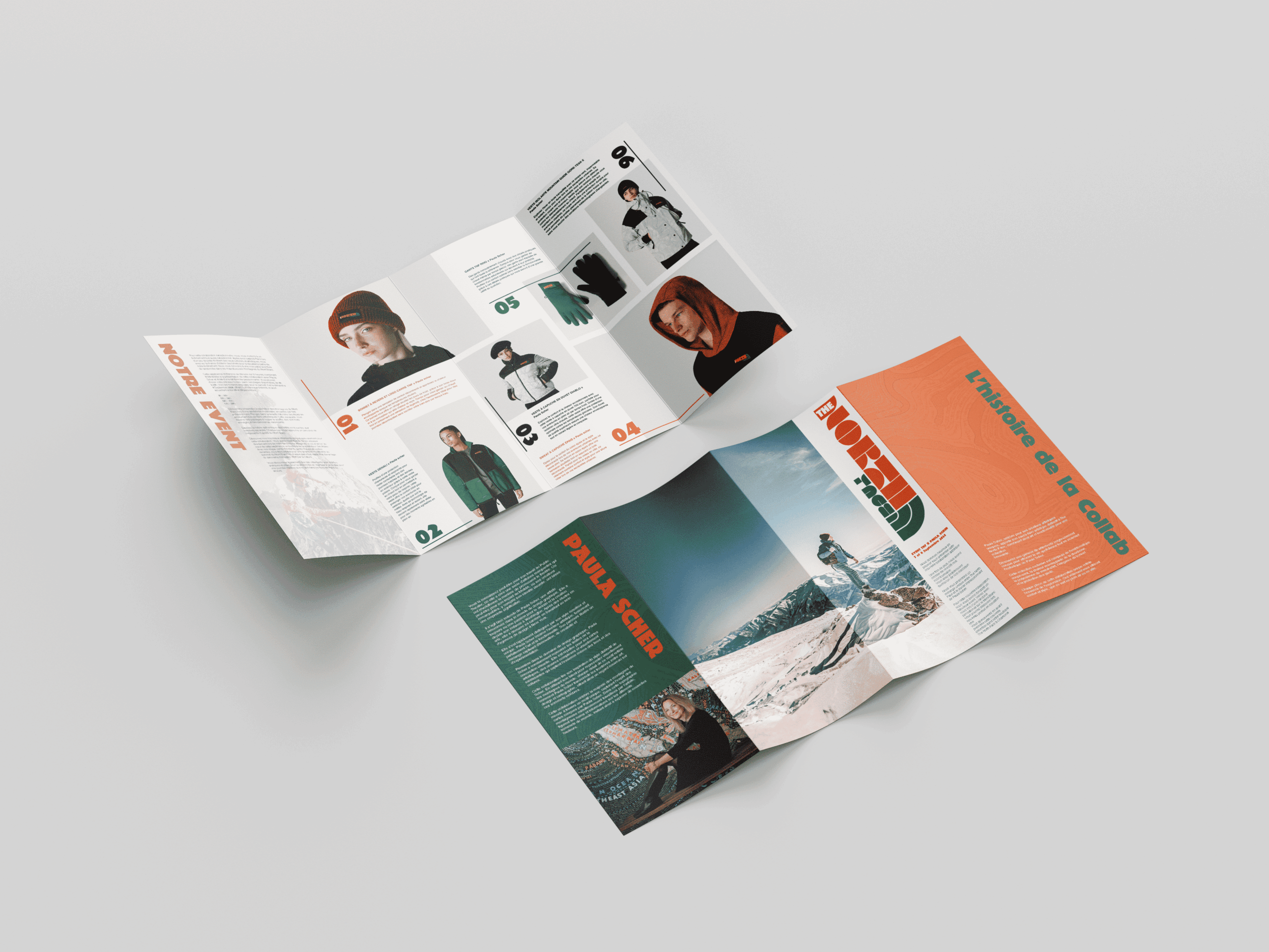
Pour accompagner l’événement, un flyer explicatif de la collaboration ainsi que des tickets d’accès ont été conçus.
L’équipe de vente porte des vêtements et des badges créés dans l’identité graphique de la collaboration, afin de renforcer l’immersion et permettre une identification immédiate.
The launch event takes place at The North Face store in Chamonix.
The scenography is inspired by Paula Scher’s immersive installations, with bold typographic signage applied directly to the walls and floor.
To support the event, an explanatory flyer about the collaboration and access tickets were created.
The sales team wears clothing and badges designed using the visual identity of the collaboration, enhancing immersion and making them easily identifiable.
Présentation
Site web
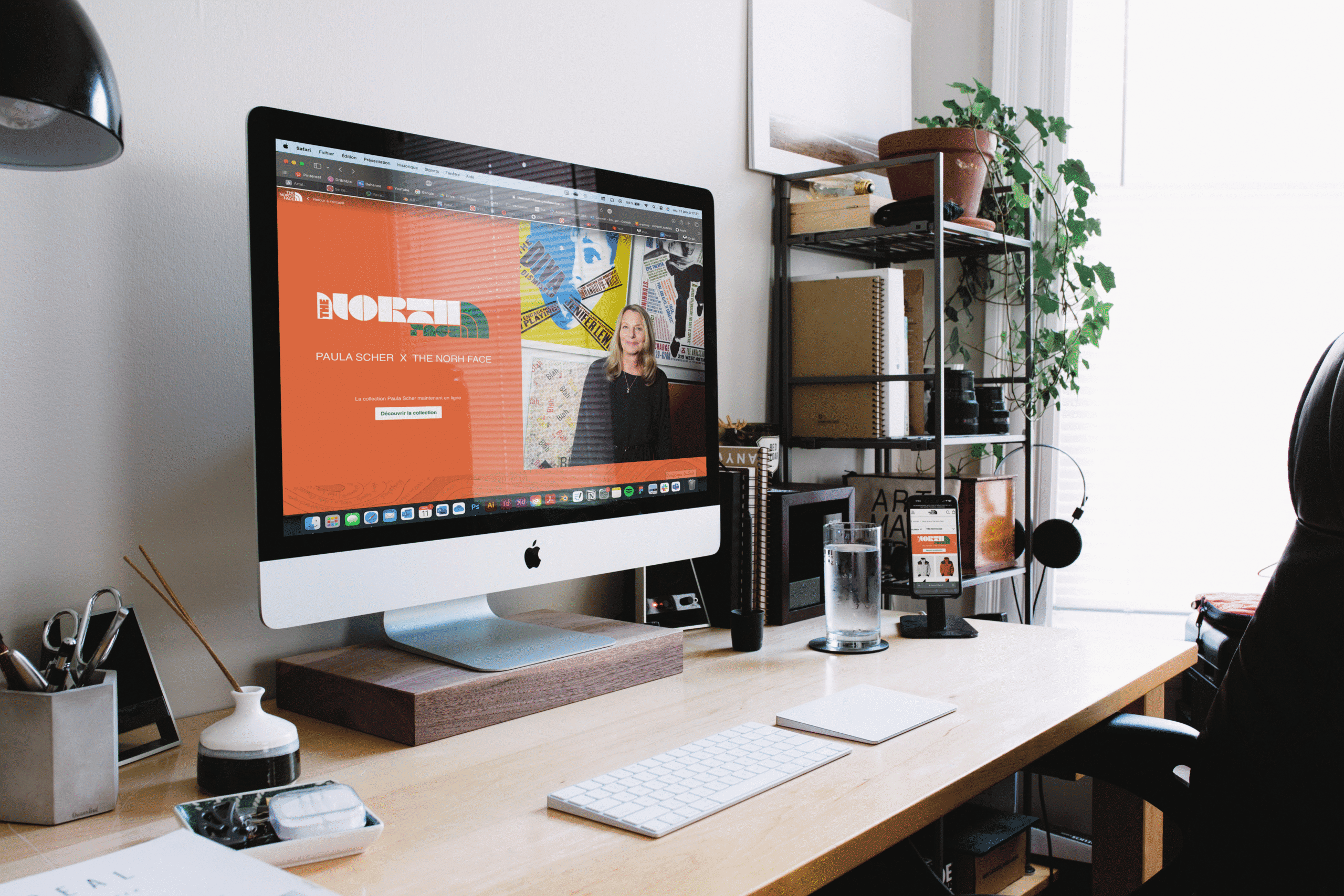
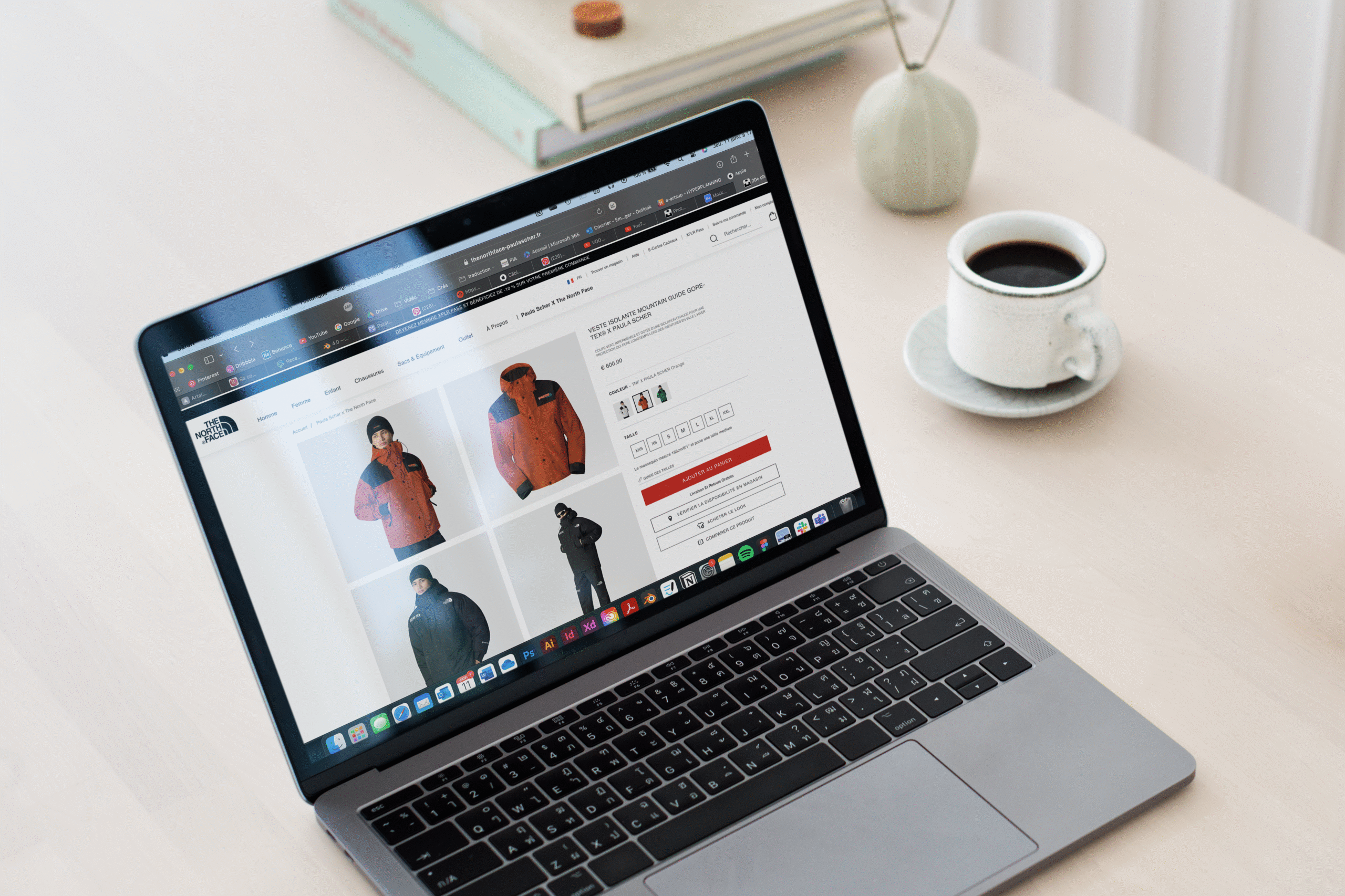
Déclinaison de l’identité visuelle sur le site de vente de The North Face.
Conception de la page d’annonce de la collaboration, ainsi que de la page produit dédiée.
Implementation of the visual identity on The North Face’s sales site.
Design of the page announcing the collaboration, as well as the dedicated product page.
Présentation
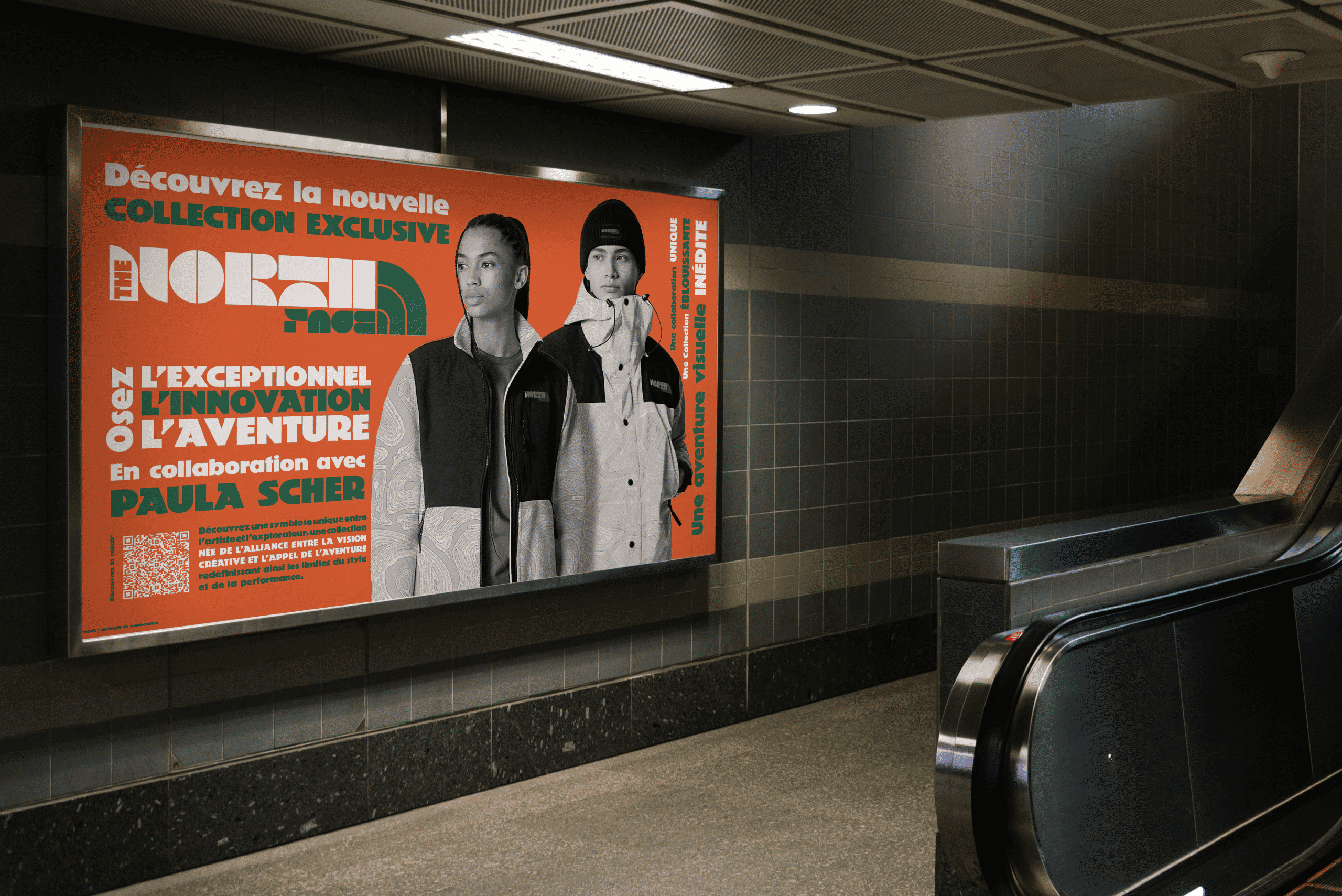
Affiche
Réalisation d’une affiche métro pour présenter la collaboration, en s’inspirant des compositions typiques de Paula Scher, souvent construites autour d’un élément central entouré de textes informatifs.
Creation of a subway poster to present the collaboration, inspired by Paula Scher’s typical compositions, often built around a central element surrounded by informative texts.